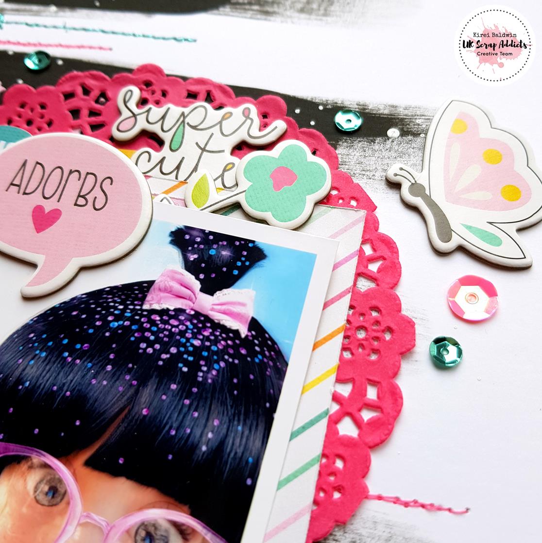
Kirei here with another layout featuring this months 'mixed media' theme... I had these super cute photos of my friend's daughter playing around on Snap Chat that was perfect for this layout!
Like some of the other DT I don't use mixed media all the time on my layouts but do like to get messy every now and then! So for my layout I was inspired to use a black painted stripe background as I have seen quite a few examples out there and really like the look of it so this is my take on it.
I used Bazzill Marshmallow cardstock for my layout as it's ideal when using mixed media as it is slightly thicker and doesn't need priming with gesso before you start. I used regular black acrylic paint to paint the wide stripes, then once it was dry I added some texture paste (that I had coloured pink) through an Echo Park star stencil to add dimension.
After that had dried I added some white paint splatters all over the layout. And then for some more texture I did a bit of machine stitching using metallic pink and teal thread.
I mounted the photos with papers from the Simple Stories 'Dream Big' collection and then added lots of the matching embellishments along with some pretty sequins from Spiegel Mom Scraps.
And finished off with a title...
So, if you have never used mixed media before hopefully this has inspired you to give it a go! Have a look at the rest of the Creative Team's layouts this month for more inspiration and don't forget to share your mixed media layouts over on the UK Scrap Addicts Facebook page...
Sam here, with my first layout as a DT member of the UKSA team…
If you hadn’t already noticed, the theme for April is ‘Sparkle’.
Now, I can’t deny that I have a real phobia of glitter – I think it’s because it reminds me of sand. Like sand, it gets everywhere, so it’s a scrapbooking product that I tend to avoid like the plague! I simply couldn’t face using any, so my ‘Sparkle’ was going to have to be introduce via some other means…
I found I’d got some Starlights paint, including White Gold, which I knew gave a true shimmery effect, so I decided that my layout would incorporate gold elements along with some co-ordinating sequins from my stash.
My eldest step-daughter is in New Zealand currently where this photo was taken. I thought the quirky seat on the wall that had become a painted swing was fabulous, along with the cupid and combinations of greens, teals and hot yellow. It’s not a colour combination that I’d usually scrap with, but was so inspired by it, I decided to dig deep into my scrapbooking stash and see what I could find.
To my delight, I realize that the Maggie Holmes ‘Carousel’ collection featured some of these tones. And, I’m sure that you can relate to just ‘saving a piece of paper’ because it’s too nice to use syndrome? I’d been suffering with that over the big top paper, but as it was just black and white, it meant that I could paint it to complement the photo and add sparkly details too!
I tend to mix white gesso with paint when I’m creating a background on a printed design, as it works in much the say way as preparing a background that’s going to be subjected to techniques such as the packaging one.
After fussy cutting the kites and the scallop detail for the big tops, I used sequins to add detail, with little French knots to each centre.
I found I’d got an unopened set of enamel charms, both of which were set into a gold metal, so this added to the sparkle along with my title.
This month is all about showing how you can really make stamps an integral part of a layout. With this in mind, I thought a monochrome theme might work really well.
I therefore began with some white cardstock. As I wanted to use a picture of my cat, I thought this black and white sheet went well as it reminds me a little of paw prints. I cut a triangle and use tape to stick this to my cardstock
I then used another white paper with a subtle marble effect on to back my photo. I inked this with black memento ink and stuck them at an angle.
I then stamped across the diagonal using some embossing ink and added a glitter embossing powder and heat set it
To the bottom left of the page I then added lots of different stamps and stickers. I also added some music note stamps around the frame as well as a camera and stars stamp above the frame.
I decided at this point that the embossing was too much so I added some more triangles of paper of this and a clear word sticker. The sticker was put onto one of the papers and fussy cut to make it stand out from the background and added some cardboard to the back of the sticker.
I hope you like the layout and will consider using more stamps in your layouts.
Something I have been wanting to try more of is using multiple photos on a layout. This month's theme to use small photos presented the perfect opportunity.
I used free app 'photogrid' to create some collages of small photos which I then sent to the be printed using the Free Prints app.
I began by adding a piece of Prima's Havana foiled paper to my navy stripe main page. On the diagonal, I added a dotty sticker, blue ribbon and a 3 circle sticker.
I cut up 5 of the small photos I printed of my nephew having fun at the park.
I backed these with some green paper to make them stand out from the background
I added some flowers, stickers, puffy words and hearts and gems.
I then used some foam squares to added the photos to the layout in a diagonal shape.
Hope you liked this layout and give your own layout with small photos a go.
Terri here, ready to kick start a new month here on the UK Scrap Addicts blog. This month the focus is on using small photos. The team have got some amazing layouts to showcase and I'm sure you'll enjoy looking at them as much as I do.
Although the trend is for using only one photo per layout, it is also on trend to use small photos. I love using multiple photos but often find myself with only one used.
I used a mix of my favourite techniques for this layout (paint, fussy cutting and stamping!) for this page plus it as features some of my favourite colours!
I'm determined to get some of my older stash used up. So I've made a promise to myself that even if I use the newest collections I have to add some elements from my older supplies.
Thanks for joining us on the blog, don't forget to share your layouts with us over on the Facebook group. We will have a folder for each month's theme so feel free to add it in there.
Kirei here with my take on this month's UK Scrap Addicts theme which was to use paint on a layout.
I had these lovely shell cut-files that I wanted to use with the Wild Heart paper collection from Crate Paper so decided to back fill them with paper that was painted in coordinating colours. I used an Inklingz paint from Shimmerz and a couple of the Starlights Metallic Paints from Imagination Crafts. Once they were dry I cut them out and then mixed some of the paint with texture paste which I used through a stencil onto each of the shell backgrounds. The cut files were then raised on foam pads to add dimension.
I layered my photo with some of the 'Wild Heart' papers and some of the cut apart tags.
I added embellishments from the coordinating 'Wild Heart' stickers and ephemera.
Finally finishing off with my title using the chipboard stickers and the lovely glittery Thickers from the range.
So why don't you join in with this month's 'Paint' theme and share your layouts over on the UK Scrap Addicts Facebook page and join in with the chat.... we love to see what you create!
It's nearing the end of Summer here so that means one thing - no more super bright layouts! We head into Autumn colours, photos of Hot Chocolate and crisp Autumn mornings and then onto the Big C!!!
But....For now...I bring you one last hurrah of this summer season and who can resist a rainbow layout (I know I can't!).
So this months theme was paint. I decided to use some acrylic paint markers for this layout and I have teamed this layout up with my Alpha Attack series on Youtube to demonstrate that you can use paint to change the colour of any type of Alpha or Thicker (because we usually have lots of those in our stash right!?).
So my thought was rainbow rain. I know this sounds crazy but here is how the layout came together.
I grabbed a whole load of half used Thicker packs from my stash and started sticking them randomly over the lower 2/3 of my page. (I did Gesso my page first knowing I was going to be applying white paint over the Thickers).
Once these were all stuck down, I then added a layer of Gesso (I actually added 2 layers because I wasn't sure how thick the coverage would be from the paint markers).
Once I had let the Gesso dry, and you can use a heat tool to speed the process up (I certainly did), I then applied 2 layers of white acrylic paint over the whole page.
Next came the hard decision as to where I was going to include my photo. I didn't want to cover too much of the background up so I went with a photo that I could cut down to just the subject image (my husband in this case) and I packed the photo with a small amount of 3 different patterned papers around the edges.
This is where the fun part came in. I used the acrylic paint markers to colour in each alpha using the ROYGBIV colours (apart from I had to substitute Indigo for Pink) and I worked my way across the page with each colour. Next I added some of the paint onto a non stick mat and added a little water and went splatter crazy! I tried to keep the coloured splatters within each of their own colour sections. I then went tone on tone with adding some enamel dots in hearts and star shapes.
I did back my white cardstock onto a piece of rainbow(ish) patterned paper. I had used a sheet of Bazzill Marshmallow cardstock which is primed for Mixed Media but it had buckled a little. So cutting down a 1/2 inch from each the top and bottom, I then mounted this onto the patterned paper to held smooth out the warping.
Next I free hand cut some clouds and used a black paint marker to give these a faux stitched border as these were getting lost on the background. Finally, because clearly there were not enough Alphas already on this layout!, I then added my title into the left cloud. I even popped a sun in to the top right cloud to keep with the theme.
In total I used a massive 97 Alpha Stickers!!! And now I need a lie down. Thanks for visiting our blog today. Be sure to head back for more inspiration throughout the month from the other ladies. Oh and we have a new theme on 1st October!!
If you want to watch the process for this layout then you're in luck as there is a process video right here for you. So be sure to head on over to our Youtube channel where you will find hundreds of videos to keep you inspired!
Hello, hello, Karen here with my painty page for September.
As you will have seen, this month our theme is paint and there have been some wonderful pages produced both with watercolour painting and mixed media. Sadly, I don't have those skills and I was a bit stumped as to how I would approach my layout for this month. I was saved by Vicki Boutin - she has a new range called Field Notes and one of the papers has a pattern which is a line drawing of a garland of flowers. My problem was solved I decided that I would add watercolour paint to this paper and make my page from that.
If you would like to see how I built up my page please have a look at my YouTube here.
Please pop back to our blog again soon to see what the other talented ladies have made this month.
Today I have a very colourful layout for you. This month is all about celebrating the use of paint on layouts. With this in mind, I decided to choose a black background and keep the embellishments to a minimum.
I used a Prima Silicone brush to create the painted, textured background.
This morning I would like to share with you a layout I have made using your September Prompt of 'Paint'
Now, of course, the ideas for this are endless and it is an easy process to liberally daub paint, either acrylic or watercolours, on to the background paper and see what effect you can achieve. Of course one of the most difficult things about adding any sort of wet medium to your cardstock is that it will have a tendency to curl..which can be very annoying! To counteract this I used tape to stick down the edges to my glass cutting mat before starting adding the moisture to the paper/card.
I used a heavyweight white card for my background which is 300gsm. I bought this in bulk from by 'go to' supplier Crafts4Eternity. Of course you can use specialised watercolour paper for this but it does work out quite expensive and if you follow this simple tip you can use regular cardstock just fine!
Now, I'm no artist, but to me the techniques I used were very basic and I can explain a little of how I created the Lavender stems very simply..just follow along.
To start I took some inexpensive watercolours and mixed some pale mauve paint using reds and blues and a pale grey/green colour. I watered this down quite heavily and painted soft fluid strokes of the two colours horizontally across the page. I then gently gently painted the stems/leaves onto the background card in upward movements in random directions using a slightly darker, less watered down, grey/green colour. You can see here how I painted across the masking tape that I used to stick the paper to my mat.
Then I mixed deeper mauve colour using red and blue and started on the flower heads. To create these I used 'bobbling' movements with my paint laden brush in elongated triangular shapes. It really wasn't scientific..just keep your paintbrush moving in these shapes. You will see that these are varying shades of the purple I mixed as each flower head has a different amount of water added to my brush each time. This adds depth and field to the painting.
Once I had painted all my Lavenders, and allowed it to dry, I removed the masking tape from the edges. Undoubtedly this will remove some of the layers of the card beneath so at this point I cut a border off the edges and matted the entire piece on a piece of dark mauve cardstock.
I next set about creating the photo clusters. First I die cut two circular photos of varying size. I then used a selection of flowers and leaves to create my clusters and added the title using Puffy Sticker Alphas that I bought from Lottie Loves Paper
I hope you like what you see and that this simple tutorial gives you confidence to have a go..what have you got to lose? Do let us know what you think too!