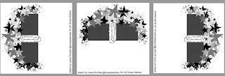
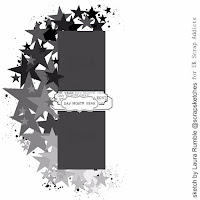
I was honoured to be asked to draw up a sketch for this month. I've also created a layout using the sketch (Click here to watch my process video)
 It is for an album for a friend so it is left blank for her to add journalling, names, places and dates - all the bits that the taker of the photo knows best - plus her kiddies will then have their Mum's handwriting on their layouts. I've stuck pretty close to the original sketch for my layout but I want to talk a little bit about changing up a sketch in this post.
 The first and perhaps most obvious way it to rotate the sketch 90 degrees. Most sketches will also look different when rotated 180 and 270 degrees unless they are a really symmetrical design. Another option is to flip the sketch, or mirror it. As it happens, this sketch flipped looks the same as the sketch rotated 180 degrees. Then there are options to change the shapes. Where you see a star you may add a heart, or a circle, or whatever takes your fancy.
Changing up photos is also an option. If the sketch calls for two small photos buy you prefer using 6x4's, just switch them out. It may mean relocating the title, or scaling up the whole design but this is fine.
 You can also completely change the feel of a sketch by adding your own colour scheme. My sketches tend to be grey tones so you don't feel restricted by which colours to use. All shares of one colour versus rainbow versus ombre versus black and white....it will have an impact on how you're layout looks
My final suggestion is just to focus on one or two of the elements in the sketch and let your imagination run free with the rest of the page. For example with this sketch you could focus on the crescent of shapes (remember they don't have to be stars) and freestyle your photos and title placement.
A huge thanks to UKSA for having me back as a guest.
If you'd like to see more of my designs and sketches then you can follow me on the below links too!
Blog
Youtube


No comments:
Post a Comment
Thanks for your comments...