Showing posts with label scrapbook process. Show all posts

Friday, 21 September 2018

Enjoy Today | Karen Moss | Paint


Hello, hello, Karen here with my painty page for September. 

As you will have seen, this month our theme is paint and there have been some wonderful pages produced both with watercolour painting and mixed media.  Sadly, I don't have those skills and I was a bit stumped as to how I would approach my layout for this month.  I was saved by Vicki Boutin - she has a new range called Field Notes and one of the papers has a pattern which is a line drawing of a garland of flowers.  My problem was solved I decided that I would add watercolour paint to this paper and make my page from that.


If you would like to see how I built up my page please have a look at my YouTube here.


Please pop back to our blog again soon to see what the other talented ladies have made this month.


Karen x

Saturday, 15 September 2018

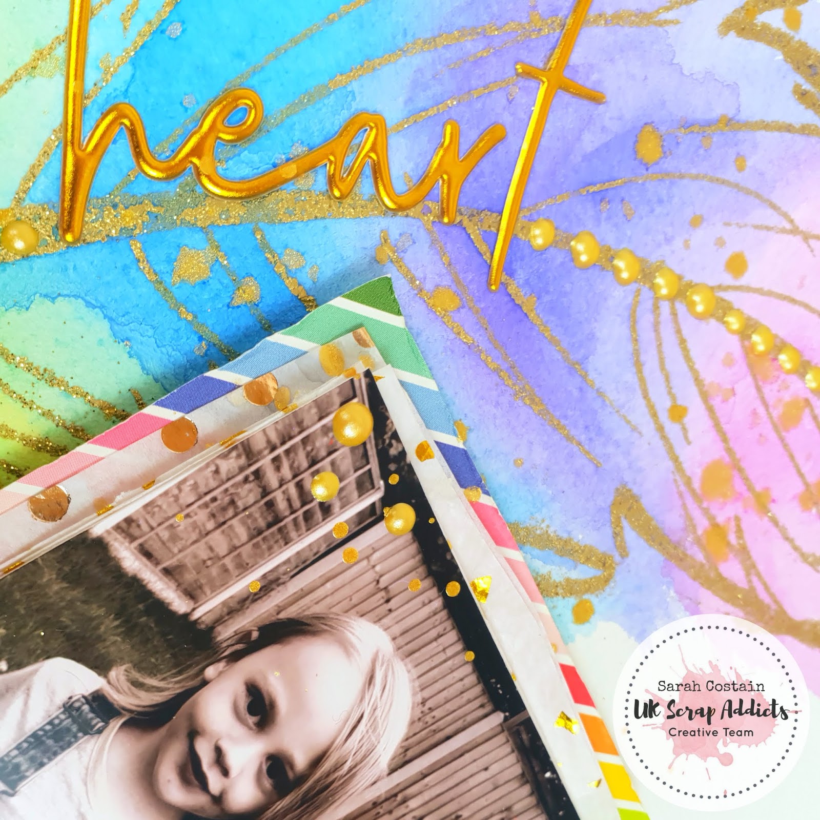
Amazing Heart | Sarah Costain | Paint

Sarah here today for this months challenge using paint which is something I love to do on most of my scrapbook pages.

I decided to use watercolour so used a watercolour 12x12 paper for my background available at Thompsons Craft Supplies.

Using an embossing pen I sketched out a feather and coated it in Gold glitter powder. Once melted I added a rainbow of paint over it to fill in the shape.

I layered my photo onto tissue paper and rainbow paper from the July Mind the Scrap kit. I tucked washi behind the photo for added texture and mirrored this down the side of the layout.

Scripty Thickers also from the kit were perfect for my title running along the feather and some splashes of gold Color Shine and pearl drops added a finishing touch.

You can check out the process video here.

Thanks for joining me and have a scrappy day :)

Sarah

Saturday, 23 June 2018

Baby Boy Blue | Lou Thompson | One 6x4 photo


Hello scrappers and welcome to my 2nd piece for UKSA. This month's challenge was to make a layout using one 6x4 photo, so style wise, this was very much open to interpretation.

I had this gorgeous blue  and white coloured wooden board page I have been dying to use and remember this cute photo of my nephew I took when he was little. Has has the most amazing blue eyes  and a cute blue fluffy coat on so just goes great with this paper.


I have a few favourite mixed media items currently; Prima Impasto paints and Ranger Oxide inks. I chose a few paints and mixed them with modelling paste. I also took a few oxides in matching colours and used these along with the paste to add stenciling to the background. I am just loving blues and greens at the moment so really love the results.

From there it was fairly easy as I didn't want to loose all this lovely texture so kept it simple. I added die cuts and a journalling card, washi, a wooden circle, a resin flower, some stickers and chipboard alphas, a tassel and a perspex camera and word.

Here are some close ups and please so visit my YouTube channel to see the process. If you enjoy the video, please give me a thumbs up and maybe a comment so I know you like what I am doing :)

Youtube link:


Main Paper, star embellishments, Bramble Fox perspextives, Doodlebug stickers and other similar items available from:


Tuesday, 1 May 2018

Happy and crazy girl | Maria La Chica | Monochrome

Hello again everyone!

Yes, it is Maria with you again! It is May, a brand new month and also when we introduce the new design team to the group! You can see the new team in this post. I hope you join me in welcoming them to the team! But a new team means a new schedule, so I am now at the beginning of the month rather than at the end.

So this month's theme is Monochrome. We had a bit of an internal discussion beforehand trying to figure out what monochrome really means as some people had different ideas. We reached the agreement that we can do a couple of different things: we can either choose a colour and use different shades of that colour, or we can choose black and white with an accent colour.

And that's what I've done! As you will be able to see in my page below, I have gone for a very neutral background in grey, with B&W papers, and then an accent of pink-ish coral.


The papers are mainly scraps from a 6x6 pad by Simple Stories - DIY boutique. It is an old collection, but I am sure it can still be found in some online shops. It is a very versatile collection, with tons of basic colours.


The embellishments are from Felicity Jane. Unfortunately, Felicity Jane is an American company that is very difficult to get hold of in the UK. You have to order directly from them and the shipping costs and taxes are not cheap. I have bought a couple of collections, but from UK second hand shops, which makes it so much more affordable.


The photos I have used have quite a neutral colouration, so I was quite lucky to be able to choose any accent colours that I wanted. I happened to have the most embellishment pieces in this coral/pink-ish colour, so that's the one I went for (plus it is my daughter's favourite colour...)

For the title I used the "happy" word from Felicity Jane, alpha stickers by Tim Holtz (which are back in stock at Hobbycraft! yay!) and the word Girl from the Girl Squad collection thickers.


And here is my process video, so you can see how I struggled to repeat the paper positioning that I had originally come up with!! :P


Thanks for joining me today, and read you soon!


Monday, 14 August 2017

Happy Here & Now │Gemma Summers │Clustering


Hello, Gemma here with my layout based on our theme for this month, which is Clustering.

I love clustering because I like to use a lot of embellishments on a page as you will see from my layout this month! Having clusters of embellishments helps your eye travel round the page, and I have used them to surround my photo, with one cluster on each side. I chose to base my layout on a selfie of me at my craft desk, which I printed in black and white so I could chose any colour palette for my layout.


I started with a lined paper (I used a lot of the Pebbles 'girl squad' collection for this layout). I went with my photo central and decided to ground the clusters with some mixed media first.

I went with pinks, peaches and coral made using some distress inks and the packaging technique. I then added some splatters and crayon marks. I knew most of this would be covered up but some would still peak through for colour.


Next I could focus on my clusters.

I started by fussy cutting the speech bubbles, trees and raindrops. These elements were all from pattern paper, individually cut and arranged. I backed the speech bubbles onto craft foam to raise them and give the cluster different dimensions. I always start with the bigger elements, then move onto details like the puffy stickers, buttons and roller stamping.


I worked on both clusters at the same time, so they looked balanced and both had all the same elements in them. I stuck to coral, turquoise, black and white.
As the layout is about me, I chose stickers that match me like the backpack, headphones
and the girl puffy sticker even has my hair cut :)

The title was made from turquoise glitter words from Paige Evans, as I like the script font and the colour fits perfectly. It's a recent photo of me so really is 'here and now'. I used stamping in diagonal corners and added a doodle border round the entire page, with black pen.


Don't forget we would love to see your layouts using clustering this month
on our Facebook page and Instagram using #ukscrapaddicts

I hope you enjoyed this layout.
Is your craft desk your happy place too?

See you next month!


Friday, 14 July 2017

Our Getaway │ Gemma Summers │ Large Photo

Hello, Gemma here with my first layout for UK Scrap Addicts!

This month we are focusing on large photos in our layouts, and so I decided to challenge myself with a large 8x12 photo. I went with a big landscape view of our trip to Scotland last year, so the large photo could reflect the beautiful scenery.

I started by cutting into the photo! I trimmed the mountains edge because I had an idea to add to the scene by creating a cloudy blue sky. On some white cardstock I used some distress inks to create the bright blue backdrop. I fussy cut some clouds from Pink Paislee 'summer lights' paper no.05 and also used my cloud die to cut out clouds using paper scraps. I doodled round the edge of them with black and grey pens to help them stand out. 


Once I had stuck my photo on top of the sky layer I began to work on my title, which I placed on the photo. I used the chipboard 'Getaway' from Crate paper's 'Oasis' collection and kept the cluster simple with black enamel dots.
I used the white globe perspextive from Bramble Fox, who is our sponsor this month!


The Layout was looking very blue and green at this point and I love colour so wanted to add some accents in. I went with some small bright buttons, which I glued down and drew lines up to meet the clouds. I think this added some whimsy to the page and worked on a diagonal with the title.

Don't forget we would love to see your layouts using large photos this month
on our Facebook page and Instagram using #ukscrapaddicts

Thanks for joining me today and I hope you enjoyed this layout.
See you next month!


Wednesday, 12 July 2017

Best View Ever | Polly's Papercrafts | Large Photo


Hi lovelies, 

It's Emma here with you today with a layout using a large photo. For my large photo I decided to make use of a panoramic shot that I took in Barcelona. 

Most smartphones will have a Panoramic mode on the the camera, which while they look amazing, don't print so well in a normal format. 


I popped my photo in to Pages on my Mac (you can do the same in Microsoft Word) and resized it to fit the page. I then just printed at home on A4 glossy photo paper - easy! The final print was about 4"x11.5". 


For the background I used a die cut heart 12x12 piece that I bought from Like For Ever a while ago and backed the open spaces with squares of pattern cut from the Pink Paislee/Paige Evans Oh My Heart collection (Paper 24). 


Then came the fun part of embellishing! A large photo doesn't leave a whole lot of room for embellishing, but in my panorama I had managed to capture a random man who, while I'm sure he was very nice, I didn't want in my photo - so I covered him up with a tag and a cute camera from Crate Paper's Oasis collection.


Of course you can see the full process of embellishing and title placement in my YouTube video here.

Thanks for joining me today, I hope you manage to make use of some of those photos that deserve prominent placement in your albums. Remember to share on social media using our hashtag (#ukscrapaddicts) so we can find you! 

Until next time...


Tuesday, 27 June 2017

Hogwarts | Michelle Mills (UglyBugPlans) | Moodboard

Moodboards that contain bright and bold colours? Yes please! This months theme is totally up me street and I had just the photo I wanted to use. The strong colours in the photo meant that I couldn't just pick one of them as a back ground colour so it was perfect for a multi coloured back ground.

I used bubble wrap and ink pads to create the back ground and chose to frame my photo in white, it then made sense for my title and embellishments to be white too. The title was actually a happy accident, I had planned to stamp the word "Hogwarts" onto the actual background in black (seeing as I have no white ink or embossing powder), before committing I decided to test stamp it on a piece of white card stock and I really liked the way it turned out!

Enamel dots gave a lovely texture and I used 3 of each colour seeing as there are 3 main objects in the photo and 3 flower embellishments, what then drove me to try to use all the colours when placing the row of enamel heart I will never know and I soon changed my mind and used just the red, green and blue to match the centre of the flowers!

You can view the whole process HERE!