I'm here to share with you today my layout based on this months theme - large photos. What a challenge. I prefer more white space on my layouts for embellishments so this was something that put me outside my comfort zone but I really loved how this turned out. So here goes....
I used Paige Evans collection, Oh My Heart, for this layout. I had this photograph of myself and my husband with some of his family on New Years Eve and I would never have paired this photo with these papers and embellishments but I felt like doubly challenging myself with this one!
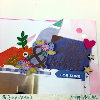
I set about thinking about the title first as I knew that my title would have to be fairly short and contained due to the amount of space I would need for my photo. I had this die cut piece from the ephemera pack and I decided to use this as part of my title which reads "Lets Stay Home and Party". I created an embellishment cluster to the left side of the photo and used a mixture of chipboard stickers, foil stickers, ephemera and cut parts, all from the same collection.
Next I created another cluster to the top right of the photo using the same items and layered a gold foil doilie underneath it all. You can see in these pictures the finishing touches I added with a few tiny wood veneer stars and some enamel accents liquid by Dovecraft (I love this stuff as it creates the same effect as enamel dots and costs a fraction of the price).
Here is the title in its entirety. I normally make my titles completely straight but for the word "party" I decided to try something difference and slanted each letter slightly to create this look.
For the background I liked this paper where it was a pink ombre one side and different coloured circles the other. So I decided to try and use both sides of the paper, without cutting into it. So I folded one side over and glued it down to create this look. I was a little bit chuffed with myself for thinking of this and can see many more layouts like this in the future. I finished it all off with a messy border and instead of using black ink, I decided to use a co-ordinating pink colour for a change. 

If you'd like to watch the process video then head on over to YouTube using this link here.... https://youtu.be/99HuFm5jmMA
Thanks for looking and i'll see you all next month...


No comments:
Post a Comment
Thanks for your comments...