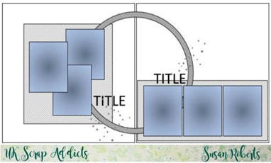
Now I’m not a great fan of double pages preferring to scrap with one or maybe two photos and 12x12 is plenty enough space to fill, thank you very much! So … I deliberately set myself with a challenge by drawing a double page sketch …

I wanted the pages to look as though they ‘belonged’ together and the overlapping circle is intended to help with that as well as the repetition of a group of 3 photos (though in my finished pages I’ve dropped that last one!)
My first hurdle was that I only had 4 photos and to overcome that I printed the one I liked best much larger, replacing the group of three on the left hand page with one large photo. You might tell that Sophia was not too keen on having her photo taken – her pouty look is sooo cute!
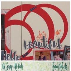
Papers (Cocoa Vanilla, Wild at Heart) and photos chosen, I took another look at the sketch and decided I really liked the circle, so I cut a couple more.
At this point, I stuck down the main elements on my page. The first thing I could see was that it lacked balance; too much on the right hand page. I added a little cluster of embellishments on the far left.
I completed the pages with embellishments from the Wild at Heart collection and a bit of stamping using my favourite stamps (Gorgeous Grunge by Stampin’ Up) being sure to repeat on one side most of the embellishments added to the other to maintain that ‘belongs together’ look.
And here you have my completed page …
Thank you so much for joining me today at UK Scrap Addicts. Come back tomorrow, won’t you?


Great sketch Sue. Thank you.
ReplyDelete