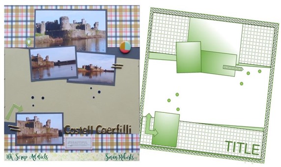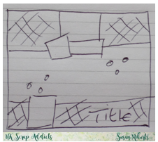
Good morning and welcome to my first post as a proud member of the UK Scrap Addicts design team. When I saw our topic for this month my first thought was, ‘Oh no!’ because I almost always scrap with one photo, or two at the most. I think the trick with using lots of photos is to arrange the page so it doesn’t look crowded – I really don’t want the ‘get all my photos on, come hell or high water, look’! So I rapidly put myself back into my comfort zone and drew a sketch!
Sometimes my sketches are literally a quick doodle on a scrap of paper – how you do it isn’t important – as long as it gets you past that paper shuffling stage it’s done its job
I adore these papers from the Fancy Pants, Golden Days
 collection available at UK store, Hey Little Magpie. All the matching bits and bobs make the page hang together so well.
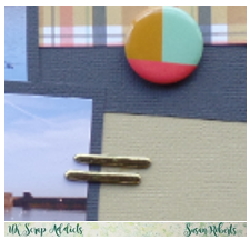
The gold alphas I have used are cheapies from Hobbycraft. They are very pretty but the sticky back does peel off so I keep them in place with wet glue.
That’s it from me; come back tomorrow for another DT post – you won’t regret your visit.
Happy Scrapping 
Blogger @ Me & Mine, http://miniowner.blogspot.co.uk/


I'm another one that struggles with multi-photo layouts, I'm a bit of a minimalist scrapper. I like to scrap using sketches too, maybe I should start looking at using more sketches with at least 3 photos :)
ReplyDeleteThis is fabulous! Love these papers too and your layout to show us is gorgeous. Love how you got so much white space on to it. I will scraplift this one for sure. Xxx
ReplyDelete