Showing posts with label emma callagher. Show all posts

Sunday, 17 September 2017

Free cut file for September

This month's free cut file is a title for you, designed by the lovely Emma Callagher.


You can find instructions for downloading and using the cut file in Silhouette here. And don't worry if you don't have an electronic die-cutter, we've got some ideas for using them without one here.

As always, we'd love to see what you create with the cut file so please do link us in the comments below and if you're on social media then please don't forget to use the hashtags #ukscrapaddicts and #uksacutfiles

We are already thinking about October’s cut files – would you like to see something Autumn related? Halloween inspired? Or something geometric for any time of the year?

Thanks for stopping by!

Friday, 15 September 2017

PENS

Hi there scrappy friends! Today the team are having a chat about pens...


Laura: I’m a stationery junkie ... I own hundreds of pens.  I’ll share a few of my favourites with you. Generally, for journaling, I want a fine tip.  I love OHTO Graphic Liners for a rich black waterproof ink.  I have them in every width but tend to use the narrowest nib 005 and the widest 10 the most.  I also have a fun novelty kiwi pen that writes beautifully.  For ink that is not black, I reach for my Pigma Micron in blue and brown or my Stabilo Fine Liners which I’ve had for more than a decade! I have a few more favourites too ... a Slick Writer from American Crafts for writing on photos, Pilot Silver and Gold Markers for a touch of metallic (also work well on photos), Faber Castell PITT pens for brush lettering and finally, Derwent’s Graphik Paint Liners.  These are my favourite for art journaling, they are slightly unpredictable and can be ‘incontinent’ which is great for splats and splodges and generally inky fun!


Emma: I’m with Laura, I LOVE stationery - always have, always will! Let’s be honest, there’s nothing quite like the satisfaction of writing with a good pen is there?... No?... Might just be me then - haha! For the rare occasion that I do actually journal on a page, I reach for my Uni-Ball Uni-Pin pens (a bit of a mouthful, I know!). I bought them in a pack of 5 with a range of widths from 0.1mm to 0.5mm. They’re a black, waterproof ink and they write beautifully on cardstock and on glossy photo paper - for me, they’re a good ‘all-rounder’ and I reach for the 0.1mm the most. The Holy Grail of course is The White Pen!  This is a tricky one and it depends what you’re after. I wanted an opaque, bright white pen that would write on cardstock and glossy photo paper and wouldn’t be a pain in the backside (I can say that right?) in terms of smudging. I originally bought the Sakura Gelly Roll pen because so many people had good things to say. However, I made the mistake of buying the Gelly Roll SoufflĂ© pen which writes kind of translucent, goes bright white when dry, which takes ages, and is also kind of raised when dry too. It’s OK for some things but not quite what I was looking for. It also has quite a thick point, making small writing difficult. For a white pen, I would actually recommend the Uni-ball Signo Broad white gel pen. I bought mine from Paperchase but they are widely available I believe. The Signo Broad is the best white pen I’ve found. It writes smoothly. It dries pretty quickly. I have used it on glossy paper with no problems. Although it’s called broad, the tip isn't so big that you can't write small. It’s a nice, opaque, bright white and I would thoroughly recommend!


Michelle: It’s funny that I’m answering this now as I’ve been on the look out for a white pen to write on my photos and have been having a hard time choosing, thanks to Emma I now have a Signo Broad on its way to me which I am super excited to try out! As for what I currently use on my layouts ... I’m not really fussy about brand but it does have to be a gel pen with a fine nib, my writing is awful and that stands out when I use thicker pens. My favourite brand of pens are the Coleto by Pilot and I use a 0.4mm nib for standard journaling. However lately I have fallen in love with brush lettering and although I’ve not been brave enough to try it on a layout I have been adding it to my art journal. I use calligraphy ink, gold is my favourite to use ... it’s so shiny,  and a good quality paint brush, I’m by no means an expert but it does add an interesting dimension to the page!


Lisa-Jane: Another pen hoarder here ;-)  I’m always on the look out for the perfect pen and I actually know what I want, it just doesn’t exist yet!  My favourite pen to write with is a random floral fine tip that I had in my shop last year.  I wouldn’t normally choose a thin pen because I like something more substantial to get hold of but once I used these I fell in love.  Before that I was a huge fan of the common Bic Biro for writing and I will reach for that most often for anything other than on a layout.  The pen I use most often for journaling on my layouts is a Pilot Frixion which can be erased when you make a mistake!  A pen that rubs out??!!  Yes!  Genius!  My only issue with it is that the nib isn’t fine enough for my liking, especially when you are journaling in a small space and have a lot to say.  Ideally I would have a pen that writes like the skinny floral, feels like the Biro, yet has the ability to be rubbed out - if someone could arrange that thanks (or enlighten me as to their existence!).  Colour wise for me it has to be black, I hate writing in any other colour.  I have used a white pen on a black background and I once used a friend’s grey pen on a layout but nothing feels quite right compared to black.


Sarah T: My go-to pens for journaling on my pocket page spreads are definitely my Uni-Pin Fine liners. I use the 0.1 - 0.5 tips as they're super smooth for writing with, I even use them for doodling. I also use the Stabilo coloured pens if I want to journal or doddle in a different colour.


Gemma: So I may not have the pen knowledge of the other Scrap Addicts, but I love to use pens on layouts. I like to outline, add doodle borders and faux stitching in different colours on pages. My favourite pens in my collection are the American Crafts precision pens, Uniball Eye Micro, and for coloured pens I have the Staedtler Triplus fineliners. They all sit in a pen stand on my desk, within arm’s reach.


So there you have it fellow scrappers - the Pen Queens have spoken! 

Friday, 1 September 2017

JOURNALLING

Our monthly theme for September is journalling. Over the next month our creative team's layouts and blog posts will all feature journalling in some way.

In today's joint post the team are discussing if we journal on our layouts, and how we incorporate journalling into our scrapping...


Maria: Journalling is a very important part of scrapbooking for me. 99% of the time I include at least a line or two and the date to my page. On some occasions, I even go the extra mile and tell a whole story behind the photo. Personally, the whole process of scrapbooking is divided 50-50 between memory keeping and a form of art that I get to keep. I have created pages that were all about the art and the products and not so much about the story behind the photo, and those layouts tend to be my least favourite. I spend more time looking at the layouts that tell a story. Unfortunately, though, sometimes journalling comes as an afterthought in the scrapbooking process. If I have a long story to tell, I make sure the journalling is designed into the layout from the beginning. Otherwise, I just find a spot somewhere suitable to add my lines and date.


Michelle: When I create my layouts I create them for future generations of our family, I want them to know who we were, what we felt and the small things that made up our daily lives. I hardly knew my grandparents and have nothing that tells me about the kind of people they were, which is why journalling is so important for me. I tend to journal less on my 12x12 layouts but give short explanations on what was going on in the photograph and why it was important to us at the time. I use a traveller’s notebook as a mini album that I really go all out on the journalling in. I find that I’m not as fussy in my TN and often use scraps from other projects to create my layouts and then I add lots of journalling, sometimes it’s big events, other times I might journal about small things my kids have said or done.


Emma: OK, so in total contrast with the lovely Maria, journalling is really not a priority for me when making a page. It’s the very last thought, and if I do anything it will usually be surface level journalling like; who, where, when, etc. I sometimes feel that I need to make an effort to look a bit deeper and tell more of a story but it doesn't really ever happen. I’ll usually add a couple of lines of journalling, not for the words, but more for the design aspect. For instance, if I feel like the layout needs a bit of balance, I’ll use black pen and write a sentence or two to add weight to certain areas of the page.  I have made more of an effort to journal on pocket page spreads. I have been documenting a trip to Barcelona in a pocket page album and have definitely made more of a conscious effort to record more memories and experiences from the trip. 


Lisa-Jane: I’m guilty of not putting enough journalling on my layouts.  I used to be really good and not consider it finished until I had written a little bit about the event etc.  Now though I do most of my creating at a crop and I find I can’t concentrate enough to write my journalling.  Also I find that I prefer to add my journalling once the layout has been published on-line and then I forget!  I’ve got so many layouts in my albums without their story attached and I really need to go back and sort that out.  Of course, not every layout NEEDS journaling.  Sometimes we take so many pictures and yet we’ve told all the story that there is to tell but we just can’t resist scrapping even more cute photos.   I was scrapping with my little girl the other day and she asked what else she could put on her layout.  I advised her to add some journaling and she said she didn’t really like writing on her layouts because it spoils it and I know what she means.  I know it’s important to have examples of our handwriting etc for future generations but I do find that sometimes the journaling ends up looking untidy.  This is the time to use hidden journaling.  If I’ve wanted to share a particular story but perhaps it is not something I want to share with the world or I don’t want it on the front of the layout for some reason, I have been known to use photos as flaps and then write on the underneath.  Another option is tucking a tag behind one of your layers, and the option I went for in this layout was something called a ‘Scrapalope’.  They probably don’t exist anymore but any envelope will do or you can make a pocket from scrapbooking paper if you are concerned about longevity.  In this layout from quite a few years ago now, I used the Scrapalope to contain a letter to our first baby who we lost a couple of months after this photo was taken.  It’s the only photo of me whilst pregnant with her so I wanted to tuck the journaling away.  It’s still there for me to read  but you have to make an effort to get to it so anyone just browsing my album wouldn’t really bother to read it and would just enjoy the layout as it is.


Jess: For me a page just isn't complete without journalling. The whole reason I scrapbook is to tell my stories. Sometimes that means a whole 6x8 page of text and sometimes it means a few lines on a project life card. I love the creative outlet of scrapbooking but really the words are equally as important as the photo in my eyes. I keep a daily journal that I started for the 100 day project. I use a weekly traveller’s notebook insert from Traveler’s Times on Etsy and each night I fill the 10 lines with a few details of the day. This helps me loads when I'm scrapbooking especially if I get a little behind with project life. I don't always take enough photos so it’s great to look back on what else happened that week that I didn't have photos for. When I'm scrapping one photo at a time I try to think back to how I felt when the photo was taken, what could I hear, what could I smell, what was I feeling, who else was there and what nice or funny moments were there. Doing some of that helps to inform my journalling. Sometimes I will alter the format and write my journalling in the form of a letter, this means I can direct my thoughts to a particular person. I have written letters to my son as well as myself and that makes for much more personal and honest journalling. If all else fails and you just don't know what to write try to imagine you have a friend next to you and they ask, "What is this photo about?" Then write down what you would tell them. 


Pol: I generally add a few lines about the photo, place it was taken etc, to my pages, but because a lot of my layouts are design team work that will be shown to a larger audience, I tend to do my journalling after I've photographed them. Although I scrapbook for the enjoyment of the process, when I do journal I try to include my own handwriting. I never really knew my grandparents and I think how much I'd cherish my Gran's handwriting, or even my mum's when she is no longer here, so I'd like my children and future generations to have a that record of me.


Hidden journaling on the 'Details' tag, a small letter to my daughter tucked away...


Sheena: Journalling on my layouts is a bit hit and miss. Because I also do Project Life I know I’m already telling our stories there so am less concerned what I add to my layouts. If I have something important to record I sometimes write on the back of my layouts.


Susan:  I’m afraid I rarely journal on my pages beyond recording who is on the photo and the date. I am not scrapbooking to record for future generations, and, having read the comments of some of my design team colleagues I wonder if I should be thinking more about recording for posterity. To be honest I regard my scrapbooking  as an artistic hobby; I scrap photos I like, in no particular order, and spend a lot of time on elements of the page such as the title. Occasionally I do write a few lines by way of explanation, but only rarely. I am going to make a determined effort to at least record the circumstances of a photo on the back of my future pages. One thing I do do, though, is incorporate journalling as a feature usually in place of a title, which I will show you more of in my post next week.


Gemma:  Like Susan, I would say I scrapbook as an artistic hobby. I don't journal, but I do always add the date of the photo onto the page, with my roller stamp. This was until recently when I actually tried journalling! I was really pleased with the result, and what it added to the page. I think it's something I want to go back and add to a lot of my layouts as over time I will forget places and events. I do keep a traveller’s notebook which holds stories I want to tell with their photos. I see the journalling in this book as being personal to me, so it's a project I keep for myself. Overall I would definitely say my journalling style is something I am still discovering. 


Sarah:   I like to write a line or two of journalling on my layouts. I go more in depth if I feel there is a story to be told, but as so much of my scrapping is just everyday snaps of my 2 year old there is not always much more to say. I prefer to keep my journalling hidden. Not for privacy, more that my handwriting is a bit hit and miss. I think hiding it on little tags, and in pockets adds a fun interactive element, too. 


Jackie:  I sometimes struggle with journalling straight onto my layouts, but I do like to add hidden journalling on tags when I can. Sometimes if I'm doing a series of layouts from an event, then I will add pocket pages and will use that space to add my journalling. 


Sarah T: As a Pocket Page scrapper journalling is a big part of my layouts. I like to include a little story on each of the photos. Occasionally I need to tell a bit more of the story than I can fit on a little journalling tag, so I'll use a fused on pocket on do some extended journalling on the back.


Thank you for sharing with us! I hope we've helped and inspired you to have a go at this months new challenge featuring journalling!

Tuesday, 15 August 2017

FUSSY CUTTING

Hi lovely Scrappers! Today the team are having a chat about fussy cutting...


Maria: Fussy cutting is awesome! I love love love it, despite not being the best at it. I love how you can get so much out of a 12x12 sheet of pattern paper by just fussy cutting the shapes out of it. Some people use huge scissors, and some others use small scissors. I am in the second group. I normally try to leave a small border around the shape that I am cutting, although it is not always possible.


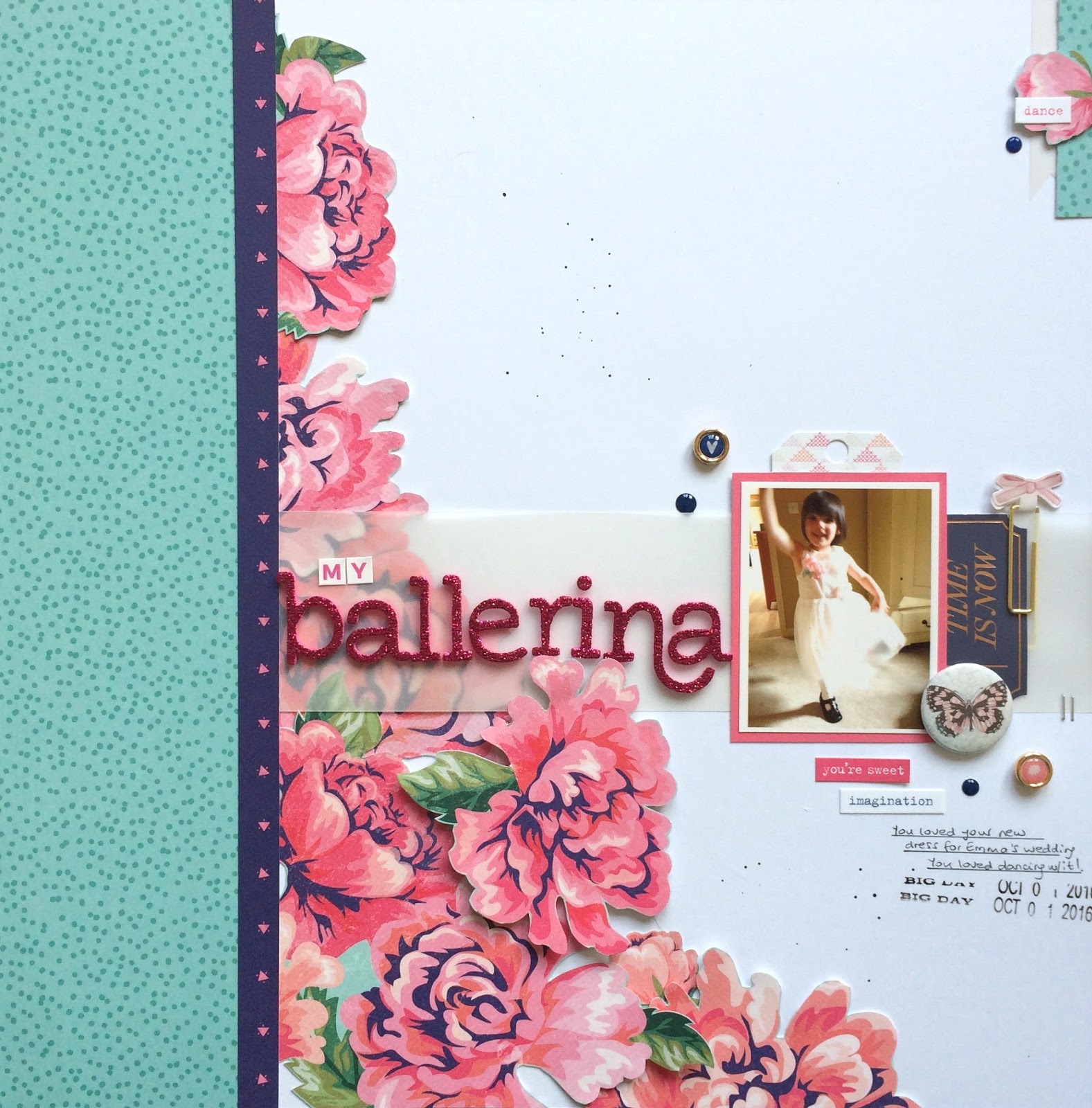
Emma C: Ahh fussy cutting, labour intensive but oh-so-worth-it! Some papers just cry out to be fussy cut and one particular designer that springs to mind is ... you guessed it! ... Paige Evans. Her designs are perfect for cutting out images and layering them for something spectacular - especially the florals! Here is a prime example, created when I attended a workshop last November. Top Tip: when cutting try to move the paper around rather than the scissors, saves your hand aching a bit! Also, a good pair of small sharp scissors that cut right to the tip are a must. Happy cutting!


Jess Claire: Fussy cutting can be kind of time consuming but I love the look of it. I am a bit of a budget scrapbooker at times and I always feel like fussy cutting gets a lot of value from the paper. My tips are to start by roughly cutting out the shape; that way it's easier to move as you cut it. Depending on the look you want, you can cut leaving a border; I like to do this if the image has a white border behind it, because it then looks a bit like a die cut you might buy. Alternatively, you can cut right up close to the image; I tend to do this more just because its less obvious if you cut something off so you don't have to be as precise. I really like to adhere fussy cut pieces with adhesive foam tape, which pops the piece up and makes it look more like a true embellishment. Finally, don't be scared to use a large fussy cut piece - it can be the focal point of the layout.


Terri-Ann: I absolutely love fussy cutting! My GoGo Getaway nickname is 'scissor ninja' because I love to cut shapes from patterned paper. I find it relaxing to sit in front of the TV with a crazy busy pattern and cut out all the images. If it's super intricate I will leave a slight border but prefer not to. I also like to get my craft knife out to cut out the inner pieces from designs such as between flower stems and leaves.


Lisa-Jane: I'm quite partial to a bit of fussy cutting - like stitching, it can be a lovely way to pass the time while chatting with friends or watching your favourite programmes, etc. Like many others, I like to cut things out of my patterned papers to use in place of die cuts or to layer up on top of each other to add some dimension. Despite having a Silhouette and quite a few sets of Thickers, I do sometimes fussy cut a title, like I've done here. We have a few sets of alphabet templates between our local groups and I used them to trace the letters onto a coordinating design for this layout, then stitched around it to add some texture.


You don't have to stop at titles or flowers though, try things like ticket stubs, etc. I've also been known to cut out images from Project Life style cards such as cameras, hearts, and frames. The layout below is quite an old one now but I wanted to show an example of another different kind of fussy cutting. I've used chipboard shapes as templates to trace onto thick card stock, cut them out, then applied Mod Podge to some old jeans to make it stiff enough to adhere the card stock shape onto and trace and cut out. They make really unique embellishments and are worth the effort I think.


Pol: Fussy cutting is one of my Favourite Things Ever! I used to hate it because I cannot cut a straight line to save my life, but it turns out that makes me ideal for fussy cutting! LOL!
I like to leave a border around whatever I'm cutting out, and I love to make little scenes for my pages. I will purposely choose papers that can be fussy cut, and I enjoy fussy cutting while I'm watching TV in the evening. I'm really rubbish at sitting doing nothing so I'm often doing several things at once! Fussy cutting is a great way to make your papers go further if you're on a budget.


Susan: I too am a fussy cutting fan. I especially like to do it at crops when I can sit and chat and keep my fingers busy at the same time - it helps to keep them out of the chocolate, too! Any papers with large images are fair game; I sometimes wonder if I cut out just for the sake of it as I seem to be sticking the pieces back into the same place as they were originally! LOL! Seriously though, if you put the pieces back with dimensional sticky dots under some of them it gives your page some nice height and texture. I always cut close to the edges of an image not being too keen on white borders. I will even cut off the border from a ready made sticker. Occasionally I will fussy cut a photo if there is too much distracting background. I don’t like the white edge you get when cutting into photographic paper; a good tip is to gently edge the cut image with a dark ink.


Gemma: I agree with the others in that I love fussy cutting! I love doing it to create extra embellishments for a page. My favourite would be a fussy cut floral, and I love to fussy cut a whole 12x12 paper leaving a small border around the shapes. By leaving a border you get some of the background colour come through, in this layout I liked how the green broke up all the pink.


I like to fussy cut my own free-hand shapes as well, like I did in the moodboard challenge layout, where I used coloured raindrops. Also in this layout you can see that, like Susan, I will even fussy cut a photo to help create the scene on my page.


Laura: My tip for fussy cutting is to keep the scissors still, only moving the paper and to experiment with different scissors. Personally I fussy cut best with my largest pair as they are more comfortable to hold.


Michelle: It looks like l might be the only one on the team who doesn't love to fussy cut. I love the end look of it but I’m just not very good at it, although I have been incorporating it into more layouts, especially in my Traveller's Notebook. I now have some super sharp scissors to make the job easier. I may even get round to using some of the many cut-apart sheets that I have collected and stashed over the years. I agree with what others have said in that it is much easier to move the paper and not the scissors.


I do hope we've inspired you to crack out your sharpest scissors and get snipping!

Saturday, 15 July 2017

INK PADS AND STAMPS

Hi lovely Scrappers! Today the team are having a chat about ink pads and stamps...

Claire: I love stamps! I just do not use them enough, I collect and hoard them. I have done a few layouts that have been focused on stamping and I love the end results. However, I think the reason that I don’t stamp more is the fear of messing it up. Stamping is definitely a technique to master. I also own 15 (yes 15) roller phrase stamps and I use these frequently to add finishing touches to my layouts. I generally just stamp these in black Versafine ink and often do a “ghost” stamp where I stamp multiple times without re-inking to get the ombre stamped effect (I feel I’ve just made that term up - ha ha). I think the general consensus for most scrapbookers is that they own stamps and do not use them enough. So, my commitment from here on in is to use my stamps more!

Gemma: I only have a small selection of stamps, which I really need to use more. My favourites are my two rolling stamps, the Shimelle date stamp and a Dear Lizzy phrase stamp. I like to use these as a final touch to a layout, stamping a few lines near a cluster of embellishments. My favourite ink pad is StazOn which I have in black.
If I want to get messy for a mixed media look, I have some of the large Tim Holtz Distress ink pads. I use these with the packaging technique. To do this I stamp the pad straight onto some plastic packaging, then I spray some water on top, which makes the ink react. The ink applied onto cardstock creates a pretty watery effect for a background.


Lisa-Jane: Using ink pads and stamps either alone or together, can really expand your crafting stash in a cost effective way. You can make your own patterned papers to use as backgrounds or extra layers if you don't have the exact piece that you feel you need or you can add little pops of interest and detail with the smallest of stamps, and anything in between. I do use stamps on my layouts now and then and I really need to use them more as I love the extra layers that they can create. I'm a huge fan of Tim Holtz Distress inks and the new Distress Oxides and I definitely wouldn't be without my Vintage Photo ink pad and blending tools for inking the edges of most of my papers etc on a layout. I used to think they were all about the grunge and eleventy billion shades of brown but as you can see from this layout they can also be nice and bright too. This page is from a holiday album where I used a particular collection right the way through. I was getting short on full pages and I had an idea to make a matching background sheet and I was so happy with how it turned out. I used thin washi tape to make a geometric pattern over some white cardstock and then used the blending tool and two bright colours of Distress Ink over the top. I pulled off the washi tape and hey presto, a full, matching, background sheet for the price of a plain sheet of cardstock! The inks and stamps might be an investment to begin with but as long as you choose generic styles or colours you scrap with a lot then you will definitely get your money's worth.


Sarah T: I love the idea of stamping, especially on Pocket Page layouts. I really like; stamping on photos, repeat stamping, creating stamped embellishments, and a good old date stamps. I did some repeat stamping recently as a title card and really loved it. I used an alpha stamp and black StazOn ink. I'm actually really pleased we've covered this topic because stamping is something I'm always keen to do more of and I've picked up loads of tips from the rest of the ladies. I hope you have too.


Vicci Lou: Stamps are by far my fave thing to use ever! I think every new scrapbooker should invest in a couple of cool sets. They're so versatile; mix that in with some scraps and different coloured inks and you can make lots of embellishments, which is great if you're on a small budget. Stamps are great for adding texture and interest to backgrounds and also for adding those little final touches to layouts instead of say enamel dots or sequins. Yes, they are a flat element on the page but if you use the right contrasting colours you can really make them pop!

Kirsteen: I'm more of a collect and hoard kind of stamper. I love the idea of stamping, being able to reuse an image I really love but the reality is my stamp collection lives in a pretty box that I swoon over every now and then.


Susan: Hmm stamping? Not my favourite technique. I am not good at getting an even pressure and so end up with extra ink, or not enough ink, on the finished image. I recently invested in a We R Memory Keepers Precision Press Tool which should help but I haven’t opened it so can’t report back yet (I bought mine from UK company, Cre8tive Online). I have found that ‘you get what you pay for’ both with stamps and with inks and also that it is worth experimenting to get the right ink for the job. I use a lot of inking on the edges of cut papers on my scrapbook pages; it gives a more finished look, I think. Some inks are just too ‘inky’ for that but Tim Holtz Distress Inks do the job perfectly. However, they are hopeless for stamping a crisp, clear image and, to be fair, they were never intended for that purpose. Cheaper stamps and especially some of the freebies on magazine covers, seem to splay out a little and smudge the image; I am happy to pay a bit extra and buy a really good stamp; those from Stampin’ Up, for example, are excellent. And a wee tip - did you know the little round blending foam pads fit perfectly in the bottom of the mini Distress Inks? So you can store each one with its own colour.


Maria: Confession time! I only have a handful of ink pads. Until recently, my idea of stamping on a layout consisted of adding the date with a date stamp! (and I do this on my layouts 90% of the time). However, I have ventured into making a feature of stamping on my layouts in the last few months. It doesn't happen often, but when it does, I go big! I like stamping directly onto the background, and if the cardstock is textured you have to make sure that you are impressing your stamp correctly, otherwise it may not look sharp. And beware the stampers nemesis: dropping your stamp on your layout by mistake! I must confess that it has happened to me more than once! My favourite ink is Versafine; I use it for stamping my date and for other bits and pieces. For colour inks I have a couple of colours of Distress Inks and a couple of colours of Stampin’ Up pads. I am currently saving a bit to invest on some more pads!


Emma C: OK, one thing to remember is not all ink pads are created equally and the one you choose is totally dependent on what you want to do with the image. First of all there are different formulations of ink. Pigment ink, dye ink, hybrid ink, embossing ink, waterproof ink ... I know, it's a minefield! I would recommend checking out Jennifer Maguire’s YT channel as she has great videos explaining the differences between the lot. From a personal point, I love Tim Holtz Distress Inks for water colouring and blending. I use Ranger Archival Jet Black a fair bit because it gives a fab crisp image. I've also recently started using Clearly Kelly Hybrid ink by Hero Arts, which look blotchy to begin with but smooth out when they dry.
In terms of stamps, I prefer to use clear stamps, usually the ones made from photo polymer are of a higher standard and give a better image when stamped. Clear stamps also let you see where you're stamping as you can see through them - bonus.
*psst* Don't worry if you're like me and never clean off your stamps, it doesn't hurt them!

Jess: So I swore I was never going to be a stamper. I tried it a few times with a variety of bad results. I even sold all my studio calico stamp sets online. Then a pen pal sent me a pad of StazOn black ink. This is now the only ink I use. I have a Project Life roller date stamp and a Heidi Swapp stamp set and that's all I use. The StazOn ink is great and as Emma said, its OK to not clean them, especially if you only use one colour. One technique I do like to do is to repeat the stamp until the ink on it has run out, to give kind of a shadow effect. Its a nice quick and easy way to get an interesting feature on a page.


Michelle: I absolutely love to stamp, it's my favourite thing to do! I don't own a massive variety of stamps but the ones I do have are excellent quality and can be used in a range of techniques. I'm not particularly an arty person so the stamps that make up a scene or the stamps that have two parts (dual stamp) are my favourite, when you combine them with good quality ink pads you can use them again and again without your layouts ever looking the same.


Some great hints and tips there from the team, I know I learnt some new ideas too! 

Thursday, 15 June 2017

SOLID MEDIA

Hello scraptastic friends! Today the team are having a chat about solid media...

Jess: I started out scrapbooking using Project Life and my loyalties still lie with pocket pages. I liked the simplicity of slipping in cards and photos and not having to do anything too artsy. I've always believed I am no good at art but I am learning lots as I go. Saying that, I refuse to use chalk, that stuff goes through me, especially when used on paper. I am actually tense just writing that. Does anyone else feel that way about certain textures? Anyway my chalk hating aside I do sometimes use solid mediums to add colour. I have used wax crayons but mostly I like pencils. There's just something kind of comforting about colouring in with coloured pencils. So much so that I own about 3 different packs of Crayola pencils even though they rarely get used. My favourite way to use them is to stamp images on to white card using black ink and then colour in with pencils or crayons. I can then cut the shapes out to use as die cuts. I've done this a few times, especially with floral stamps. I love it when creativity can be money saving.


Sue: I’m not really one for experimenting with media in my scrapping but I have always had a weakness for pens. I own way more than I will ever need! I use them on my pages for journaling, doodling, frames. My handwriting is large and bold so I almost always write with a Berol fine nib Italic pen - they are available in Ryman’s or, if you go through them as often as I do, buy in bulk from Cult Pens (a VERY DANGEROUS website for pen addicts!) My number one favourite for journaling on dark cardstock is the white pen made by Signo - the broad Uni-ball - try one from Paperchase then hop over to Amazon and buy in bulk from omghowcheap  or Cult Pens have them, too. Oh and a final tip - never leave your Sharpies in reach of a toddler!!

Emma C: Oooh OK, solid media is a bit of a tricky one and, honestly, it’s not everybody’s cup of tea. The one that I use most often is texture paste, which is also often called modelling paste or holding paste depending on the manufacturer. A lot of scrapbookers use the Ranger Texture Paste and have great things to say about it, it’s thick and holds its shape well. I currently have some Pebeo Modelling Paste which is great but a little runnier than I would like sometimes. Texture paste is great for putting through stencils and giving a subtle pattern or element of interest to the background of your page. If you want to have a play with mixed media, texture paste is a fun one to try! Another solid medium commonly used is Faber Castell Gelatos, a kind of soft pigment stick that is creamy and smooth and reacts with water. They can be purchased online or Hobbycraft carry some too. I must say, I have only played with Gelatos once, at a retreat where I borrowed a friends, and I think they must take a bit of practice to achieve your desired effect. They tend to work better on a surface that has been primed, or Gessoed, and when applied direct to paper I found they take bit of work to get them to blend. However, many crafters really like Gelatos and love the effects they can create - check out Missy Whidden on YouTube as she has many videos using them to great effect!

Lisa-Jane: I'm experimenting a lot more with mixed media of various sorts but as usual I'm pretty late to the party. When masks etc came out a few years ago I bought a nice selection that could double as embossing folders in the Cuttlebug and I purchased a small pot of expensive texture paste. I'm always keen to try cheaper alternatives and I came across several blogs and YouTube videos showing DIY versions by mixing pva glue, acrylic paint and talcum powder. I tried it out myself and was pleasantly surprised! Much much cheaper, keeps for ages and you can make it as thick or as runny as you want depending on your needs. You can see how I've used it here through a Happy Scatter stencil to start building up a background. The great thing about the home made version is that you can add coloured acrylic paint to give you different shades of paste without making it too runny. My children have really gotten on board with getting different effects in pastes and paints and I'll often go into my studio to find a random bottle top or toy car tyre on my desk!

Roxy: Ah solid media. One of my favourites. Since I was little I have had a love for pencils, pens, paint pens. Basically anything in a stick form that I could create with. It took me a while to put two and two together and realise I could actually use all my arty products in my scrapbook layouts! I haven't looked back since. To this day my favourite solid media are Gelatos and texture paste. I find Gelatos the easiest to work with, just draw on some scribbles and blend out with my finger or a little water and voila, it looks pretty! I also have various other solid media such as Derwent Artbars and Derwent Inktense blocks, however, I mostly don't use these in stick form. If like me you find them a little overwhelming, I found the best way is to use them like watercolour paints! They blend well and are very pigmented. They create wonderful backgrounds or project life cards.

Pol: I really don't get on with Gelatos. It's probably lack of use but I just don't seem to know what to do with them! I used to use a lot of chalks in my early scrapping but I haven't used them for years now. I do like texture pastes used sparingly, they really give interest to a plain background. My favourite solid media though is my Pilot V5 black pen! I use it on nearly every single layout for journaling or adding hand drawn borders. It's also wonderful for creating zentangle backgrounds. However, I have also been known to steal my youngest son's crayons to use on a layout!

Laura: When I think of solid media I think of my lack of success with oil pastels (one big muddy mess) chalks (coloured dust everywhere including up my nose) and Gelatos (I just can't get the hang of them!) Then my eyes start twinkling as I think about my Inktense pencils. I love them. I even have a custom made roll so I can take the whole set away on holidays with me. Here is why I love them: their versatility is second to none.
I use them as regular colouring pencils in colouring books and fussy cut out the designs. They blend nicely as dry pencils. Then you can use them as watercolour pencils, the only difference being that they are permanent when dry. With lots of water you can get that soft watercolour effect but use them stronger for amazing intense colours. I also use them as I would inks/mists. Pop a little water on some packaging and scribble the pencil in. You then have colour that can be smoothed on to the page or picked up with a brush and flicked.
I have them all and the colour range is great, every colour is catered for BUT should you need another shade they mix beautifully.  Have I convinced you?!