Showing posts with label joint post. Show all posts

Saturday, 15 July 2017

INK PADS AND STAMPS

Hi lovely Scrappers! Today the team are having a chat about ink pads and stamps...

Claire: I love stamps! I just do not use them enough, I collect and hoard them. I have done a few layouts that have been focused on stamping and I love the end results. However, I think the reason that I don’t stamp more is the fear of messing it up. Stamping is definitely a technique to master. I also own 15 (yes 15) roller phrase stamps and I use these frequently to add finishing touches to my layouts. I generally just stamp these in black Versafine ink and often do a “ghost” stamp where I stamp multiple times without re-inking to get the ombre stamped effect (I feel I’ve just made that term up - ha ha). I think the general consensus for most scrapbookers is that they own stamps and do not use them enough. So, my commitment from here on in is to use my stamps more!

Gemma: I only have a small selection of stamps, which I really need to use more. My favourites are my two rolling stamps, the Shimelle date stamp and a Dear Lizzy phrase stamp. I like to use these as a final touch to a layout, stamping a few lines near a cluster of embellishments. My favourite ink pad is StazOn which I have in black.
If I want to get messy for a mixed media look, I have some of the large Tim Holtz Distress ink pads. I use these with the packaging technique. To do this I stamp the pad straight onto some plastic packaging, then I spray some water on top, which makes the ink react. The ink applied onto cardstock creates a pretty watery effect for a background.


Lisa-Jane: Using ink pads and stamps either alone or together, can really expand your crafting stash in a cost effective way. You can make your own patterned papers to use as backgrounds or extra layers if you don't have the exact piece that you feel you need or you can add little pops of interest and detail with the smallest of stamps, and anything in between. I do use stamps on my layouts now and then and I really need to use them more as I love the extra layers that they can create. I'm a huge fan of Tim Holtz Distress inks and the new Distress Oxides and I definitely wouldn't be without my Vintage Photo ink pad and blending tools for inking the edges of most of my papers etc on a layout. I used to think they were all about the grunge and eleventy billion shades of brown but as you can see from this layout they can also be nice and bright too. This page is from a holiday album where I used a particular collection right the way through. I was getting short on full pages and I had an idea to make a matching background sheet and I was so happy with how it turned out. I used thin washi tape to make a geometric pattern over some white cardstock and then used the blending tool and two bright colours of Distress Ink over the top. I pulled off the washi tape and hey presto, a full, matching, background sheet for the price of a plain sheet of cardstock! The inks and stamps might be an investment to begin with but as long as you choose generic styles or colours you scrap with a lot then you will definitely get your money's worth.


Sarah T: I love the idea of stamping, especially on Pocket Page layouts. I really like; stamping on photos, repeat stamping, creating stamped embellishments, and a good old date stamps. I did some repeat stamping recently as a title card and really loved it. I used an alpha stamp and black StazOn ink. I'm actually really pleased we've covered this topic because stamping is something I'm always keen to do more of and I've picked up loads of tips from the rest of the ladies. I hope you have too.


Vicci Lou: Stamps are by far my fave thing to use ever! I think every new scrapbooker should invest in a couple of cool sets. They're so versatile; mix that in with some scraps and different coloured inks and you can make lots of embellishments, which is great if you're on a small budget. Stamps are great for adding texture and interest to backgrounds and also for adding those little final touches to layouts instead of say enamel dots or sequins. Yes, they are a flat element on the page but if you use the right contrasting colours you can really make them pop!

Kirsteen: I'm more of a collect and hoard kind of stamper. I love the idea of stamping, being able to reuse an image I really love but the reality is my stamp collection lives in a pretty box that I swoon over every now and then.


Susan: Hmm stamping? Not my favourite technique. I am not good at getting an even pressure and so end up with extra ink, or not enough ink, on the finished image. I recently invested in a We R Memory Keepers Precision Press Tool which should help but I haven’t opened it so can’t report back yet (I bought mine from UK company, Cre8tive Online). I have found that ‘you get what you pay for’ both with stamps and with inks and also that it is worth experimenting to get the right ink for the job. I use a lot of inking on the edges of cut papers on my scrapbook pages; it gives a more finished look, I think. Some inks are just too ‘inky’ for that but Tim Holtz Distress Inks do the job perfectly. However, they are hopeless for stamping a crisp, clear image and, to be fair, they were never intended for that purpose. Cheaper stamps and especially some of the freebies on magazine covers, seem to splay out a little and smudge the image; I am happy to pay a bit extra and buy a really good stamp; those from Stampin’ Up, for example, are excellent. And a wee tip - did you know the little round blending foam pads fit perfectly in the bottom of the mini Distress Inks? So you can store each one with its own colour.


Maria: Confession time! I only have a handful of ink pads. Until recently, my idea of stamping on a layout consisted of adding the date with a date stamp! (and I do this on my layouts 90% of the time). However, I have ventured into making a feature of stamping on my layouts in the last few months. It doesn't happen often, but when it does, I go big! I like stamping directly onto the background, and if the cardstock is textured you have to make sure that you are impressing your stamp correctly, otherwise it may not look sharp. And beware the stampers nemesis: dropping your stamp on your layout by mistake! I must confess that it has happened to me more than once! My favourite ink is Versafine; I use it for stamping my date and for other bits and pieces. For colour inks I have a couple of colours of Distress Inks and a couple of colours of Stampin’ Up pads. I am currently saving a bit to invest on some more pads!


Emma C: OK, one thing to remember is not all ink pads are created equally and the one you choose is totally dependent on what you want to do with the image. First of all there are different formulations of ink. Pigment ink, dye ink, hybrid ink, embossing ink, waterproof ink ... I know, it's a minefield! I would recommend checking out Jennifer Maguire’s YT channel as she has great videos explaining the differences between the lot. From a personal point, I love Tim Holtz Distress Inks for water colouring and blending. I use Ranger Archival Jet Black a fair bit because it gives a fab crisp image. I've also recently started using Clearly Kelly Hybrid ink by Hero Arts, which look blotchy to begin with but smooth out when they dry.
In terms of stamps, I prefer to use clear stamps, usually the ones made from photo polymer are of a higher standard and give a better image when stamped. Clear stamps also let you see where you're stamping as you can see through them - bonus.
*psst* Don't worry if you're like me and never clean off your stamps, it doesn't hurt them!

Jess: So I swore I was never going to be a stamper. I tried it a few times with a variety of bad results. I even sold all my studio calico stamp sets online. Then a pen pal sent me a pad of StazOn black ink. This is now the only ink I use. I have a Project Life roller date stamp and a Heidi Swapp stamp set and that's all I use. The StazOn ink is great and as Emma said, its OK to not clean them, especially if you only use one colour. One technique I do like to do is to repeat the stamp until the ink on it has run out, to give kind of a shadow effect. Its a nice quick and easy way to get an interesting feature on a page.


Michelle: I absolutely love to stamp, it's my favourite thing to do! I don't own a massive variety of stamps but the ones I do have are excellent quality and can be used in a range of techniques. I'm not particularly an arty person so the stamps that make up a scene or the stamps that have two parts (dual stamp) are my favourite, when you combine them with good quality ink pads you can use them again and again without your layouts ever looking the same.


Some great hints and tips there from the team, I know I learnt some new ideas too! 

Saturday, 1 July 2017

LARGE PHOTOS

Our monthly theme for July is large photos. Over the next month our creative teams layouts and blog posts will all feature photos sized 6"x 8" or larger.

In today's joint post the team are discussing how we use large photos...


Jess Claire: A large photo can mean different things depending on what format you're using. My examples might sound small in comparison to 12x12 scrapbookers, but my format is smaller. In my December Daily album and my recent Week in the Life album I used a number of 6x8 photos, which, for those albums, was a full size photo. In my Week in the Life I also used an 8x12 photo which covered a double page spread (photo 1). I have done this in a Traveller’s Notebook, where I printed my photo at 8x10 and cut it down to cover both pages (photo 2). In all of these cases I have left the embellishing to an absolute minimum. I usually include one or two small pieces and maybe the date. For two of my Christmas pages I used the large acrylic words from Ali Edwards' story kits (photo 3). As a predominantly pocket scrapbooker they always seem too big, but paired with a full size photo in a mini album they look really effective. 

Photo 1...

Photo 2...

Photo 3...


Maria: Before I started scrapbooking on 12x12, I used to use 8x8 books all the time. They were very convenient for me and for a while I loved them. The problem with an 8x8 page is that a ‘normal’ sized photo looks huge! So I have quite a few layouts in my 8x8 albums where the photo is the main feature. My advice would be to not only make your photo the main focal point but also try to keep the embellishments to a minimum. The photo is already taking a lot of space in your page, so don't distract from it with tons of embellishments. Yes, keep your clusters in 3s if that's your thing, but keep them minimal as otherwise your page could look too busy. 


Michelle: To be honest I have never scrapped a large photo, I always print 6x4 and often use an app to print 2 photos on that one 6x4 print. I'm super excited to give it a try though as I find it really satisfying when I get out of my comfort zone and try something new ... and it gets all the school photos out of boxes!

Pol: I really enjoy scrapping with large photos but I don't do it as often as I should. I absolutely love the look of a page where the photo is huge and has been directly embellished or journaled on. I usually print my photos at 3x4 so even a normal 6x4 is a large photo for me!


Terri: I love scrapping with large photos, especially in my travel albums. I like to use them as a title page or as a divide between countries or cities. It annoys me that the cost of printing large photos is significantly higher than a standard print size so it means I don't do it as often as I would like. I try to use large photos that have some space in them so I can cover parts with embellishments and journaling. 


Laura Jane: I have only ever scrapped one layout using a larger size photo; this was using a 6x8 photograph on a 12x12 page, as one part of a double page layout. I did find the larger photo challenging to begin with as I was unsure which direction to go with it, but I chose papers which I could mirror on each page, added my title and kept the embellishing to a minimum. Once the layout was completed I was really happy with how it looked and have since seen some beautiful layouts using large format photographs which have really inspired me to consider this again in the future. I think the most important thing to remember is that if you're not happy with the end result you can always take it apart and re-do your layout ... as they say, nothing ventured, nothing gained. If you have never used a large photograph in your scrapbooking I would urge you to give it a try as I think it gives a different perspective to have your photo as the main/largest component of the page and can be really effective. Here is my double page layout showing the page with a large photo and minimal embellishing. 


Jackie: I find that large photographs on a layout looks great in my holiday albums. For my New York album, which is still on going, I've used a large photo as a way to divide the places I visited. For these large photograph layouts I tend to keep the embellishments to a minimum. This is also something I intend to do when doing my other travel albums. 


Susan: I love to use a big bold photograph in my scrapping, especially as I tend to stick to just one photo on a page. I like to balance the photo with a big bold title, too. My favourite thing to do with a large photo, especially one that has a central subject, is to cut the photo giving emphasis to the important bit. Usually I cut vertically, as in the page featuring my husband walking on the beach. Sometimes I’ll even cut the photo into a jigsaw of nine pieces! I have a blog post on the technique I use to do this here. My final tip; don’t be afraid to stick titles or embellishments right on your large photos.


Lisa-Jane Johnson: I do love using a large photo on my layouts - they are always so striking because they are not what we are used to seeing. They also leave a lot less room for anything else so you are working with a much narrower field of decision making! These layouts use photos you get printed on the day from some sort of visitor attraction and features one of my children sitting with Father Christmas in his sleigh at Warwick Castle. They sit right at the front of our Christmas 2013 album because of the impact of the large photos. I've seen large photos used in pocket pages by cutting them up and sort of piecing them back together in the pockets and I love the way it looks but you do have to choose the right photo and the right distribution to pull the look off and I've not managed it so far!


So there you go, my lovelies! I hope we've inspired you to break out of your comfort zone slightly and have a go at scrapping a large photo with us this month!

Thursday, 1 June 2017

MOOD BOARDS

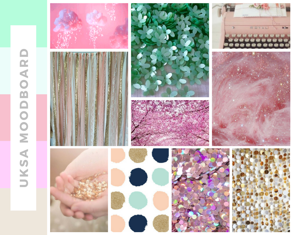
Our monthly theme for June is mood boards. We will all be working with these two gorgeous mood boards over the next few weeks...


In today's joint post we'll talk you through our individual experiences with mood boards and how we use them...

Maria: Mood boards are a brand new discovery for me. I had never used one until just a couple of weeks ago! I had seen them around, especially on challenge blogs and in Facebook groups, but I just never knew what you were supposed to do with them. Now that it has been explained to me and I know what they are, everything is clear and I love the concept. So with a mood board you get a few images that you can take inspiration from. Imagine you have an image of a pink bird, a rainbow and a ballerina ... you could create a layout with birds on it, or feathers, or anything that reminds you of a bird. From the rainbow, you could be literal and use an arch with the rainbow colours, or just be inspired to use the colours in some other way. With the ballerina, you could use a photo of your daughter dancing, or perhaps give your layout lots of texture using fabric or ribbons that resemble a tutu. So there you go, quite easy, as you can make anything you want from it and make it suit your style. I will definitely play along more often with mood boards as it is difficult not to be inspired by them.

Susan: I'm not sure when 'inspiration boards' became 'mood boards' but I do think the former term is more descriptive of the way I like to use them. The first thing I notice when looking at a ready made board is the overall colour scheme and that is the element I am most likely to pick up on for my inspiration. If I don't like the colour palette I probably won't look further into the board. I know some of you will be saying as you read our joint post, "Oh mood boards aren't for me." but I bet you use Pinterest? Pinterest is one huge reference for inspiration and from it you can easily make your own boards. I like to set up boards on Pinterest for different palettes and as I browse I pin things that take my eye - absolutely anything, flower arrangements, postcards, advertisements, room settings, clothing, you name it. I then have ready made inspiration when I need it for my scrapbooking. I noticed recently I have a bit of a stockpile of yellow cardstock, so I've got a yellow inspiration board on the go. Expect a rash of yellow layouts very soon!

Lisa-Jane: As a recent convert to mood boards I am really loving the inspiration they give. When I initially look at the set of pictures, I will usually be drawn to one or two things first and this drives the rest of the inspiration for me. I will probably decide at this point whether the board will be for me or not. You can really quickly get an overall feel (or mood!) for the board just by a quick glance at the colours and textures. Then when I know I definitely want to use that board I will look in more detail at each of the pictures and see what sorts of things I can incorporate and which elements speak to me. I never feel like I have to use all or even most of the elements and I'm happy to add in a rogue colour or texture etc, whatever makes it work for me. There are so many ways to be inspired by the same mood board over and over again by taking the inspiration in different ways and letting the different elements lead you down alternative avenues, for example a single white feather can inspire you to use white, feathers, make you thinking of sleeping on feather pillows, inspire you to scrap about birds, inspire a light and airy feel to your page, encourage you to use fringing, or even to journal about tickling! :)

Jess: I don't often use mood boards as I am more likely to create based on whatever supplies I have available. I have a fairly small stash of products so I go with whatever I have at the time until it's all used up. Saying that though I did create my own mood board on Pinterest. I was falling in love with spring time and spring colours and I wanted to put together a colour scheme to work with. In all honesty it was totally based on some enamel dots that came in a past Studio Calico kit that I loved and couldn't find anywhere again. Pale blue, peach, pink and yellow. All the heart eyes! Putting it together helped me to use products I already had and to choose new products to buy that had the colours that made me happy. When I used a mood board recently for a challenge I found that the finished layout didn't look much like the colour scheme however using at it for inspiration gave me an idea for the layout, a photo I knew I wanted and colours to start with. I still used those colours in my embellishments though and the layout would never have come about if it wasn't for that mood board.


Vicci: mood boards are literally my fave thing to draw inspiration from if I’m feeling I’m out of ideas. I love them because they allow your full creativity and interpretation to roam free but still help to get the creative mojo going. I haven't got a specific thing I always take away from them because each one is different. Sometimes a certain element reminds me of a photo I want to scrap or a story I’d like to tell. Other times it's the colours because often there are colour schemes I would never think to put together myself. More often than not I choose a mixture of the elements and the colours but I also dig deep within the mood board because sometimes there are ‘hidden’ elements that don't always jump out at me straight away. I always draft my layout whilst looking at a mood board for interpretation and I always make notes! Then I go ahead and create my layout!


Laura: I work with mood boards very loosely! Sometimes I get a general overall feel for the board or focus in on just one image; sometimes I'll go with two or three things from a board. This board is lovely, and you'd think you would have to use mint colours. Not so! You could focus in on other things... there are two lots of confetti to inspire you; there are flowers and flowing fabric; there is ombre colour (remember you don't need to use the same mint colour); there are curvy glass vases that could inspire shapes in your layout. Look a little deeper and go with the less obvious choices ...


Sarah: I do love a mood board for inspiration. I was first introduced to them while doing GCSE Graphic Design. We had to produce an A3 sized mood board as part of our coursework; it was my favourite part. I have a board on Pinterest dedicated to mood boards, and often look through the pins to spark some inspiration, be it from the colours or from the images. I find them really useful.

Monday, 15 May 2017

CARDSTOCK

Hi there, today the team are having a chat about cardstock and what we prefer to use when creating...

Claire: I like to use a mixture of sizes when it comes to scrapbook layouts. Although the traditional 12x12 is a favourite, I also use 8.5x11 (A4) and even 6x12. I use a mixture of textured and smooth cardstock and it really depends on what my layout contains as to which one I use. I tend to find you get better adhesion when using smooth cardstock so any heavier embellishments such as resin pieces or metal charms would better suit a smooth piece of cardstock. Using textured cardstock gives different media different effects. So when using Gelatos on textured card it will give an almost patterned look, whereas you don't get that on smooth cardstock. I use Bazzill Marshamallow cardstock for any heavier mixed media work, especially when using lots of water for things like watercolours or using the packaging technique as this gives less warping of the card. I like to use a higher gsm cardstock so generally 250-300gsm as I scrap a lot on white and use the patterned paper on top of this. This helps to keep the layout rigid and buckles less when putting on lots of paper layers or heavier embellishments.
Pol: I usually use a 250gsm smooth white 12x12 cardstock for my pages. It's strong, and is perfect for hand stitching as it doesn't warp. For cutting in the cameo I use a 160gsm smooth white card, as it cuts much better than a higher gsm. I'm a firm believer that you get what you pay for with cardstock, and the higher quality the more you'll pay, but it's one of those things you can't skimp on. Some things you just can't get away with buying cheaply - like toilet roll, and baked beans! Base cardstock is one of them!
Susan: To be honest I'm not too fussy about my cardstock, tending to look for the right colour first and foremost, I do agree with Pol however, in that you get what you pay for. I always scrap using 12x12 but that's really my only stipulation. Smooth or textured, I don't mind unless I am stamping directly onto the base card then it needs to be smooth. American Crafts cardstock tends to be slightly cheaper than Bazzill but I like them equally. UK shop Hey Little Magpie offers a super matching service with the patterned paper collections they sell. The other place I buy 12x12 is Paper Mill Direct - they have considerably increased their colour range in this size and are a great supplier if you want a lot of cardstock in one colour. And last from me a tip - beware the cardstock with a bar code strip! If you don’t spot it until it’s too late to chop it off it won’t fit in your album!
Maria: I used to scrap in 8x8 pre-bound scrapbooks so for a long long time I never bothered about cardstock. When I finally moved to 12x12 a new world appeared in front of me. I could use pretty much anything as my base! I was not tied to the pre-bound pages any more! I love using textured Bazzill white cardstock, as it gives so much interest, even if you are leaving it like it is without adding any media on it. At the same time, if I don't have textured cardstock I don't mind that much. I bought a pack of economy smooth cardstock a couple of months ago and I must confess that I love it. I don't know why it's called ‘economy’ as I believe it is great quality! White backgrounds are all the rage at the moment and I am guilty of following the trend. However, I also love using other colours as my backgrounds. There are tonnes of manufacturers and suppliers out there to suit every taste!
Lisa-Jane: Cardstock has a bit of a chequered past with scrapbooking doesn't it? When I first started scrapping coloured card stock was all the rage and patterned paper was only for using on top of it, never as a base layer. Then they started playing with the core of the paper so you could emboss or tear or distress to reveal a different colour. Then kraft cardstock was the only ‘thing’ to use. Then cardstock of any colour seemed to be old hat because the weights of the patterned paper were heavy enough to use on their own. Now it's all about white card stock! I do use mountains of white myself because of my die cutting. I use a lower weight smooth cardstock for most of my cutting unless the customer requests the heavier weight for stitching or mixed media. I only use smooth cardstock because that way most of the designs can be reversed/flipped etc. I really like to have a mixture of patterned paper and solid colours for my backgrounds so I tend to use a lot of borders at the moment. This is where my ‘oops’ pack comes in ... if I have cardstock that has been damaged by light or dirt or is just a hideous colour you can't imagine using ever, then I keep them in my ‘oops’ pile. If I'm building a page from a 6x6 pad or using strips or gutting some precious patterned paper etc, or if my base layer has got warped then I'll use stuff from my ‘oops’ bag as a backing. It can help to keep your designs to 12x12 when you are piecing together a background and it provides stability because it is a solid piece. I also use a piece from the ‘oops’ bag when I'm using the apertures of my die cuts - I draw through the apertures onto the waste cardstock, remove the die cut, cover the individual shapes that I've drawn with patterned paper or Washi etc, and then replace and adhere the die cut on top. I rarely throw anything away, even if it is the ugliest shade of purple! (Ed: Oi!  I've just made a purple layout!! x)
Jess: I'm predominantly a pocket scrapbooker and more recently a Traveller’s Notebook scrapbooker so I have very little experience with cardstock. I use Project Life cards or patterned paper in my scrapbooking. I have only just started doing traditional scrapbook layouts and using mixed media so I'm kind of learning as I go along with some help from the subscription kits I am a part of. I recently created my first 8.5 x 11 layout and commented on social media that I didn't have any pockets or an album in that size. A helpful UK scrapbooker suggested I create A4 layouts that fit in basic folders and plastic wallets. Since then I have done a few layouts in that size and the card I have used for my white background has been from Poundland. See, you can tell I am no expert in this particular field. It is the cheapest place I've found that does A4 card and the quality suits my purpose. The page warps slightly when I add acrylic paint but once the layouts are in the folder they straighten out. Maybe if I start creating more of these traditional layouts I will purchase good quality card stock. For now, though, my Poundland stack suits me well.
Laura:  I think everything I have to say has been said already... textured, smooth, heavyweight, cheap and premium all have their uses.  I can only add that watercolour paper is fabulous for taking lots of wet media and rarely warps.  I find it hard to get 12x12 which is my preferred size, but I've found 16x12 cuts down to one 12x12 and two 4x6 postcards.  I prefer Winsor and Newton Cotman paper for scrapbooking.

Saturday, 6 May 2017

NSD | Scrapbook Fails!

For a bit of a giggle on NSD we thought we'd share our biggest scrapbook fails with you!


Emma C: In a layout where I used no photo I wanted the focus to be on a brush script title which I was going to hand letter onto the page.  Great right?  No!  I practised, I sketched it out, I come to do it on camera - nah, not happening!  I’ll link the video here but to quote the lovely Vickie Rich, I went total ‘smudge-mageddon’ on that thing.  The title was not my friend!


Laura: Well, I poke myself with a needle a LOT when I'm hand sewing on a layout.  Fingers, hands, tummy and boobs - nowhere is safe!


Maria: The number one #firstworldscrapproblem for me is size.  Being in the UK, we haven’t got the same variety of products than in the US, so finding something the right size can be an issue sometimes!  Do you want to scrapbook in 8x8?  *Error!*  you will struggle to find decent albums and protectors at a decent price.  Have you heard of 8.5x11 scrapbooking?  You mean A4 in the UK!!  Do you want to buy a lovely single piece of 12x12 paper?  *Error!*  be prepared to pay a hefty price for shipping!  My biggest scrapbook fail so far has been buying albums and page protectors from different manufacturers believing that they would all be compatible. *ERROR!!!*  Each manufacturer will put the holes in slightly different places so you can only use their products.  Not a cheap mistake to make!  I’ve had plenty of little fails too, from smudging ink on a finished layout to pouring half a bottle of Heidi Swapp Color Shine over my page.  Thickers that didn’t glue properly and got lost along the way, or not measuring accurately and cutting the last piece of your favourite patterned paper wrong hence wasting a good chunk of it!  Some people say that there aren’t mistakes in scrapbooking, just opportunities to embellish ... but sometimes not even the biggest embellishment can cover some mistakes!


Susan: Well my first mistake was writing this paragraph then forgetting to save the doc ... grrr!  So, starting again ... I’d like to say all my scrapbooking disasters happened when I first started scrapping but I’d be lying, though there are some Bobby-dazzlers in my early albums!  I am notorious at our crop for cutting, poking or scratching myself and I’ll leave the rest to your imagination, but in future years a forensic scientist will have no trouble in identifying my work.  Any form of liquid is a no-go for me - I cannot get that carefree misting look without it looking too carefree if you know what I mean?  I once knocked over a glass of coke on my desk rendering my laptop useless and, more importantly, drowning a pile of pages waiting for a place in their album.  I have no use for a coffee cup ring stain, stamp or stencil - I can do that all by myself.  And last but not least, please tell me I am not the only person in the world to search through Cricut cartridges for a particular font, pop it in the machine then happily cut the name of the font instead of the title of my page?  Really?  No-one?  Oh dear!


Vicci Lou: Double sided sticky tape the struggle is real.  I walk a very fine line between love and hate for this adhesive.  There's no denying it's cheap and very good at keeping things in place...  So good in fact that half of my scrappy life is spent fighting to get the backing off!  It's like a naughty child though... because as soon as I have my layout complete I sit back and look at it with love and the nail chipped tape struggle is forgotten until next time.


Pol: There was that one time I painstakingly glued tiny confetti hearts in and around a heart shape on my page.  I then decided to tone it down a little by adding watered down Gesso over the top.   Epic FAIL.  It turned the confetti into a sludgy mess and warped my card stock beyond belief.  That one went straight in the bin!  I do a lot of hand stitching on my layouts too, so I've often got one on the go left at the side of the sofa.  I never learn, and they've often had anything from Chinese takeaway to Irn Bru spilled on them.  They've had a few mishaps with small children too! 


Beth: I've had a couple of cat related scrapbook fails...  I've now learnt never to leave the craft room door open if I have layouts on the table!  I've lost count of how many layouts have been ruined by little paw prints, chewed corners or worst of all ... cat sick in the middle of the page!! 


Sarah T: I have more of a confession to make. This is my third year doing Pocket Page scrapping, and I haven't completed the previous two years. Does it bother me!? A little, but all the photos are saved into dated albums on my computer, some are even printed out and in empty page protectors ready to be made pretty. I will finish them, but with a two little ones my hobby takes a sideline sometimes. Plus I'm shocking at time management and procrastinating, I'm sure I could fit more crafty time in if I was a little more disciplined, but thinking about scrapping is part of the hobby too, right?!?


Leave a comment here with your biggest/funniest/most cringe-worthy scrapbook fail (and a way to contact you) and you could win a RAK from one of my wonderful creative team.  Entries close on Sunday 14th May at 9pm.  Winners will be chosen and notified on Monday 15th May 2017.  Prizes posted to UK addresses only.


Monday, 1 May 2017

SKETCHES

Our monthly theme for May is working with sketches.  We will all be working with these two sketches over the next few weeks...


In today's joint post we'll talk you through our individual experiences with sketches and how we use them...


Susan:  I rarely scrap without a sketch!  If I can’t find one (Pinterest is a super resource for sketches) then I draw one myself, sometimes with a drawing programme and sometimes just a scribbled idea.  Even if I scraplift I’ll draw a sketch first.  You could say I’m a ‘sketch addict’ but if I haven’t got a sketch I spend an age shuffling papers and photos around being completely indecisive.  Always remember that a sketch is just a starting point to get you going - where your creativity takes you after that is entirely up to you.  It doesn’t matter if the sketch you find has a portrait photo and yours is landscape, just flip the sketch to see if it works for you from another angle.  If the sketch has four photos and you’ve only got one, try replacing some of the photos with patterned papers.  Don’t be worried if your finished page looks nothing like the sketch you started with - if the sketch got you started and you are happy with your work the sketch has done its job.  To finish, I will unashamedly link you to my blog where you will find a tonne of sketches; please use any of them as you like, but do link back to my blog.

Michelle: as a ‘newb’ to 12x12 scrapbooking I often follow sketches, usually sourced from Google, but they very rarely end up looking anything like them. I think it is more of a confidence thing for me, to ensure I'm doing things ‘correctly’ and to give me a starting point and inspiration.

Roxy: When I started scrapbooking, I had no idea what sketches were. I just went with the flow. The first time I encountered them was when I subscribed to a UK kit club. The sketch sheet baffled me, what did I do with? I thought you had to make your layout the same as the sketch, which I disliked! After a while I noticed on Pinterest that you could add your own style, now I find using sketches easier! You don't have to take everything from the sketch, maybe you like the layers or how they've placed the embellishments. Go with the flow, it's your scrapbook page after all!

Maria: I remember the first time that I followed a sketch to make a layout ... it wasn't that long ago and I took the sketch quite literally! I put my layers exactly where the sketch had them, and the same with all the embellishments. Since then, I have used more and more sketches and have become more and more confident in ‘interpreting’ them to suit my style. I don't think I have ever rotated one, but if the sketch had hearts or circles in it, I may have changed them to stars or other shapes. I am still more literal in my interpretations than other scrappers, however, I love the challenge that some sketches give me! I have worked with some ‘interesting’ ones and with some other more straightforward. There are lots of blogs out there where they set up challenges based on sketches and I love participating in these!

Pol: I hate using sketches LOL. I take them far too literally and feel stifled. I prefer to go with the flow of my own style - quite often I have no idea in my head of a layout when I sit at my desk, and it just takes on a life of its own. Sometimes I have a rough idea but I never know where I'm going to place the elements of a page till I actually make it. Sketches are a great starting point if you're just beginning, or have lost your mojo a bit, but they aren't my favourite thing.

Jess: I've only used a sketch once and it was for a challenge. I took some of the ideas and elements but created a Traveller’s Notebook page from the 12x12 sketch. I'd never used a sketch before and generally I prefer to scraplift but I found this particular sketch really inspiring. The stars fitted so well with some of the galaxy themed papers I had and a photo I'd taken that day. The sketch had a square photo but I used a smaller, rectangular one and I moved the direction of the stars. Using the sketch on a smaller scale was easier than I expected, I just used the same shapes which I made using a punch and I added a title and a tag with journalling. Most of my pages have quite a lot of journalling which isn't always a big part of sketches so if anyone has some with space for lots of journalling please send them my way.

Emma C: When I first started scrapping I didn't really get how to use sketches to their full advantage. Sometimes, using a sketch, it’s incredibly easy to feel trapped by someone else’s design. However, I think the real beauty of using a sketch is that the thinking has been done for you. Some kind soul has already thought about design and composition and photo sizing for you, and your job...? To let go and get creative. Think of a sketch as a blueprint or a rough draft. You don't HAVE to stick rigidly to it, go with the flow, see where your photo or product takes you, but use the sketch as a really awesome jumping off point!  I also love that many scrappers can use the same sketch and each end up with a completely different layout, all totally original!

Lisa-Jane: I have a bit of a love/ hate relationship with sketches... When I have to use them for a challenge or a Design Team assignment etc, I find that it really helps to get me started. I might flip or rotate the design to suit my supplies or photos but that initial “where do I start?!” overwhelm doesn’t get the chance to kick in. Once I have started though I sometimes forget about the sketch altogether and then I end up with a finished project that bears no resemblance to the inspiration at all! I have to keep it somewhere prominent when I’m working and not lose it under a pile of scraps otherwise I veer too far from the brief. My other issue with them is that they don’t inspire me on sight. I can look through loads of saved sketches on my Pinterest board but none of them will spark that desperation to start scrapping. Show me already-scrapped versions of those same sketches though and I am itching to get sticking! I guess I’m not very good at seeing the potential in a sketch where there is no colour or pattern whereas I can see potential in rooms and houses for interior design with ease! I definitely think I should challenge myself more to use bare sketches because I usually like what I come up with and I love seeing how different other people’s versions are from the same starting point.

Laura: I love designing sketches.  When I don't have the time or energy to sit at my desk and create a layout I doodle my ideas in a notebook.  The advice I give to people using my sketches is as follows; It's a jumping off point - you don't need to copy it.  Turn it, mirror it, remove a bit, add at bit, squash it smaller or stretch it larger, switch up the photo size.  Swap a circle for a star, or a flower for a flamingo!  Another shameless plug - you can find my sketches here.