Showing posts with label lisa-jane johnson. Show all posts

Thursday, 16 April 2020

Lisa-Jane Johnson | Stamping Technique | Be the Rainbow

Good morning scrappers, it's Lisa-Jane from Pretty My Page here with you today.

Things are a bit crazy for everyone right now and some people have lots of extra time and some people are fighting to get any time at all, but we still wanted to bring you lots of inspiration on this month's stamping challenge.  With that in mind, here is a layout I created a few months ago and never got around to sharing.


I was at a retreat and there was a challenge to create a layout using art crayons of some description.  I had left mine at home so I borrowed some Distress Crayons from the lovely Essie.  I ended up winning a little raffle prize too which was lovely.


I couldn't think what to do with the crayons at all and we'd all been given a teeny weeny stamp set as part of the kit so Essie suggested I try and stamp with them.  I really loved the effect!


This collection from Pink Paislee is quite old now but it was perfect for this layout about trying to find fun in the summer holidays when there has been nothing but rain.  With all the rainbows it's perfect for right now too!


I love how the little overlapping stamps in different colours just add little pops of interest and detail.  Stamping can be quite subtle but still have a great impact on your layouts.  I hope you give stamping a try and head over to the facebook group to show off your layouts!

Thursday, 19 March 2020

Lisa-Jane Johnson | Vertical Design | Stay Colourful

Hi scrappers!  It's Lisa-Jane from Pretty My Page here with you today with my layout for the "vertical placement" challenge.

I hope you are all keeping well and have good supplies of the important stuff... cake, tea, double sided tape, patterned paper...  At least we won't run out of things to do if we are quarantined, but if you run out of photos, or fancy a laugh, you could try taking some pictures with Snapchat filters like I did here very late one night on a retreat.


I've taken inspiration from a couple of similar layouts that I've seen on the Cocoa Vanilla social media using the striped multi-coloured papers that they usually have in each collection.  I was saving the last strip of mine so it was a good time to use it on a page rather than me sitting admiring it.


I tore it into pieces and spread them the full height of the page but I wanted to overlap them so I needed more than the 12 inches of the strip.  I mounted my base cardstock onto a coordinating border and then added in some denser patterns from the border strips - I don't throw much away!


I had some Simple Stories stickers from a planner pad that matched really well so I spread those along the rainbow with some fussy cut butterflies and die cut hearts.


Finally sprinkled some enamel shapes and dots around the rainbow and added the Stay Colourful die cut for the title.  Spelled the UK way!  Huzzah!  

I've been meaning to do a colour on colour layout for a while and I'm so pleased with how everything came together on this one.  I hope you've been inspired by the team's layouts so far!

Friday, 21 February 2020

Wonder | Lisa-Jane Johnson | More than one collection

Hi there Scrap Addicts!  It's Lisa-Jane from Pretty My Page here with you today with my take on this month's challenge. 

When I first started scrapbooking I used to use individual papers and put them together from any old manufacturer.  Then I started using collections and packs because I was scrapbooking more away from home so it was easier to have coordinating packs rather than making up my own kit.  More recently though, I've fallen back in love with switching things up because some of the manufacturers I love don't create collection packs or have far too many papers for me to purchase all of them. 

I store my papers by collection when I first buy them but then I sort them into manufacturers if / when I don't have too many left.  I really loved the Paige Evans Truly Grateful collection when it came out and I wanted to scrap lots of pics of us on a dog walk in the New Forest with it but actually there's a lot of pink and purple in it and not much in the way of greens and autumnal colours! 
I went to my stash of other Paige Evans papers to see what I had that would work with Truly Grateful.  Manufacturers tend to use the same colours in the printing process so there is often a good overlap between collections even if the subject matter and style is quite different.  This is great for stashbusting and stretching your stash and making your pages individual.  Some of the leaves in this layout (using a Paige Evans pre-cut cut file) are backed with Truly Grateful but the ones backed with the mustardy colour, dark green and red papers are all from Pick me Up.


I nearly used a backing piece from Horizon because I fell in love with the bright green but it was too strong so I went with the green stripe from Truly grateful instead.  I couldn't leave it border-less though and I keep a stash of sheets for backing fragile layouts so I used the reverse of one of those.  This is a sheet from an old Amy Tangerine collection that I fell out of love with but it works great as a plain sheet of white instead.

  
So that's 3 different collections I used really, which isn't much for how I used to scrap actually but it's more than I tended to use recently.  I've definitely got the bug for it again now though!


Tuesday, 21 January 2020

Lisa-Jane Johnson | Favourite Photograph | Paper Folding

Hi there Scrap Addicts, it's Lisa-Jane from Pretty My Page here today and I can't believe we are already half way through the first month of a new decade!  I hope that lots of you have been setting scrappy goals for the forthcoming year and that you'll join in with lots of the monthly challenges and visit our Facebook group to keep you inspired.


With this month's challenge being paper folding, of course I used a foldie cut file!  Paper folding of most kinds works great with any shape that has a line of symmetry and you can even create new shapes using symmetry, such as the heart shaped necks that you get between two swans when they face each other. 


I chose to create some stars in a star shape and manipulated the image so that only half of each star cut through but the lines didn't join up so that pieces stayed attached.  Then I created dashed lines straight down the middle of each star so make them easier to fold.


I folded each star and added a tiny glue dot underneath to hold it in place but still give it some dimension - this creates little shadows that give a lovely depth to the layout.  I backed the small stars with dark blue and then laid the whole thing over the aqua to fill in all the rest of the large stars.  I did try and leave it without a border but I couldn't do it so I added a trim of another dark blue paper to make it pop.


I used up lots of my extensive collection of wooden stars around the paper folds and then a sprinkle of Shimmerz paint for extra interest.  I mounted my photo onto grey paper to match the Perspextive and then onto the dark blue again and popped the whole thing onto foam for more height.  The Boys Rule collection from Cocoa Vanilla is perfect for my children's previous primary school uniform.

I hope you've been inspired to try lots of different ways of paper folding and if you need an easy place to start then symmetry is your friend - remember those painted butterflies we used to make as children?!  Don't forget to tag us if you share your paper fold layouts on social media, we'd love to see!

Happy scrapping.


Thursday, 19 December 2019

It's Pumpkin Time! | Lisa-Jane Johnson | Hidden Elements

Hi everyone, it's Lisa-Jane from Pretty My Page here today with my spooky take on this month's challenge.  


I had lots of photos from my youngest niece's birthday party 10 years ago, but I had been avoiding scrapping the event because there was something wrong with most of the pictures.  I wanted to still use them as there were parts of each photo that I wanted to remember so this hidden elements technique meant that I could still scrap them without them being on show on the front of a layout.


I used this flip out technique that I remembered using in a Shimelle feature on Two Peas in A Bucket a few years ago.  She scrapped a 6x4 photo for each month of the year, gaining a photo each month so January had one, February had two and so on.  And yes that meant that December had 12 6x4 photographs on ONE layout!  


This technique featured in July with 7 photos but there is also room for 2 journalling spots so there's plenty of real estate for whatever you need to use it for!  You basically just make a concertina which stacks up on one side of your layout so that the front page element looks like two 6x4 photos next to each other.  One of the photos flips out and the other stays put but of course you could flip out both side if you wanted more space.


The 2 photos and mats in the central portion of the layout mean that you don't need much else to complete your page.  A few stickers popped up on foam to create a diagonal flow down the page was all it needed to finish it off.  I'm still loving using the Simple Stories Vintage Halloween collection because it's so easy to use.


Other than a couple of background layers and the small amount of embellishment, the main feature of this layout is the concertina so it comes together really quickly.  Once you've cut your 12x12 in half and folded it up to create your flip out, the tricky bit is done.

I hope you've been inspired to hide some elements on your pages this month and perhaps you've been inspired but this flip out technique.  Please do tag us on social media and share your pages on our Facebook group so we can share the love!

Happy scrapping!


Tuesday, 19 November 2019

Super Star | Lisa-Jane Johnson | Masculine Layout

Hi everyone, it's Lisa-Jane from Pretty My Page here today with my masculine layout for this month's challenge. I have a 13 year old boy and a fair bit of boy themed stash so it was a perfect challenge for me.


I busted out my Cocoa Vanilla Boys Rule collection and some mixed media for this layout.  I was using up some old cut files and some odd photos that hadn't made it to another layout so it came together really quickly,
I love how the texture paste stars pop on the dark background and give some interest around the cut file.  The colours in this collection are so perfect for any age of the chaps in your lives.

You can also see the addition of some lime green paint smudges on the background cardstock.  I confess this was an accident after I tried some mixed media on the reverse and didn't realise I had swiped it on the back too.  A happy accident though :-)

We look forward to seeing all your masculine layouts over on our Facebook page and on Instagram so don't forget to tag us!

Best wishes


Friday, 17 May 2019

Fill Each Day with Gratitude | Lisa-Jane Johnson | Fussy Cutting

Hi crafty friends, it's Lisa-Jane here today with my fussy cutting layout for this month's challenge.  I do love a bit of fussy cutting - it's a way of being crafty without sitting down at your craft table to do a full layout.  The results can be an icon or two for a finishing touch of a full on page of ephemera.  My layout is something in the middle.


I used a sketch from Page Maps to create this layout at a scrappy weekend away.  This Girl Squad collection by Pebbles had a pack of ephemera that included a few flowers but I needed a lot more to poke in the top of the central column.  Thankfully some of them were circles rather than fiddly flowers with lots of petals and because flowers are natural and organic, it doesn't matter if they are not perfect circles ;-)


To create my background layer I applied some Dylusions ink using the smooshing technique and then went over the top with a script stencil and some texture paste, all from the Pretty My Page shop.  Then I started building the paper layers to create the main structure of the design.


I also applied some of the texture paste to the aqua music themed paper for a bit more texture and interest.  Then I started adding in my fussy cut flowers and popped some of them up on foam pads and poked others in and around them.  I love the effect of all the dimension and it really gives a lovely focal point to the layout.  It's definitely worth the time put in to cutting the flowers in the first place.  

Are you a fussy cutting lover or hater?  Let us know!  And don't forget to pop over to the Facebook page or tag us on Instagram if you've been inspired to create a layout for this month's theme.


Wednesday, 17 April 2019

Everyday I'm Sparklin' | Lisa-Jane Johnson | Sparkle

Hey there Scrap Addicts!

I have to confess, I'm not a huge fan of glitter (don't hate me) but I've been meaning to try and make a shaker pocket for years (I'm not even kidding) so this month's sparkle challenge seemed like the ideal time to give it a go.


I wanted to scrap this photo of my daughter attempting to paint her nails and then I found the perfect  journalling card to go with it from Simple Stories Dream Big collection.  I planned the composition of the layout knowing that I wanted to use this month's free cut file as my shaker pocket down one side so I created the background first and then moved on to the tricky part! 


I cut the star file on white cardstock as large as I could and then I backed it with clear acetate that I retrieved from the bin when I was on a scrappy retreat recently.  I went around all the edges of the die cut with foam tape and sprinkled some appropriately coloured sequins into the stars.  It felt good to finally get some sequins out of my stash and onto a page!


I used some of the unicorn paper to put a "lid" on the shaker pocket.  I tried to make sure that none of the unicorns were identifiable behind the sequins as I just wanted to use the colours in that paper rather than the images.  Once my shaker pocket was in place I could add some finishing touches of a few puffy stickers and another little sprinkle from the sequin mix. 

Although my shaker took me a while as it was my first one, I'll definitely do it again.  It's a fun way to change up my layouts and use something sparkly without getting myself covered in glitter!

With love and colour


Sunday, 17 March 2019

Lisa-Jane Johnson | Black Background | You Say I'm a Witch

Hi everyone, it's Lisa-Jane from Pretty My Page here today with my black ground project. 


When we were given this brief I must admit, I panicked a bit!  Then I thought of various themes where I might have used a lot of black before.  If I had been thinking rationally I could have easily created a layout around my son playing rugby as his kit is black, red and yellow.  But instead I went to another of my great loves - Halloween! 


I created a cut file based on a quote I had seen on various Pinterest boards and I used this as the main focus of my layout with some orange patterned paper behind.  I also added a border of paper from the Simple Stories Vintage Halloween collection that I was using for this layout.  This breaks up the black a bit more and enabled me to use more pattern on the layout - I do love me some pattern!


Because the quote is quite big, I only had a small amount of room for my photo and embellishments.  I managed to squeeze in some more colour and witchy themed goodies from the collection and of course I had to add some enamel dots for more pops of colour. 


I'll let you in on a secret (if you haven't seen my Instagram post) that this was the second version of this layout - I knocked over a bottle of very runny glue and it went on the black cardstock.  The glue does dry clear and I thought I had cleaned it up well but it turns out that even clear glue shows up on black cardstock and so I had to start again!  Every day is a school day and all that...

With love and colour

Monday, 18 February 2019

Traveller's Notebook | Punches | Lisa-Jane Johnson

Hi there crafty friends, it's Lisa-Jane on the blog today with something a but unusual for me - a traveller's notebook!  In fact three double page spreads.  I might have got carried away with my punches...

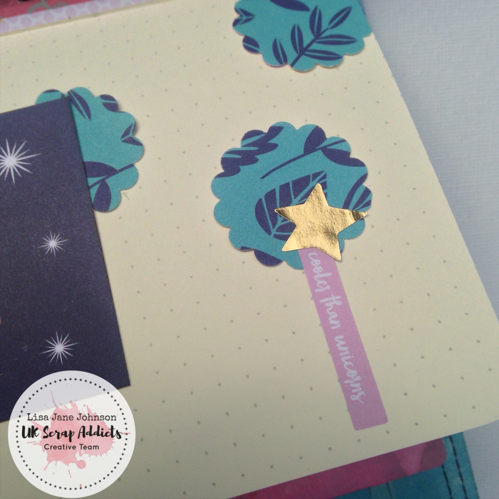
Punches are brilliant to use on TN spreads because they really do pack a punch (do you see what I did there...)  The extra small scale of the pages mean that a little bit of pattern goes a long way so using a punch helps to get variation to the shapes you can use.  In the first spread I've used a scalloped circles cut in half to create some interest to the border. 


For my second spread I used the same scalloped circle to create a rough line on a slight diagonal to draw the eye down the page.  The punches help give continuity and allow little splashes of the same papers to be spread through several pages.


This whole traveller's notebook is going to be a mini album of a Go Go Getaway retreat where Shimelle was the guest designer so I'm using lots of Glitter Girl papers but in small splashes throughout the book. 


My final spread used a scalloped border punch to create a layered section in the bottom half of the page which fades from dark patterned papers through to lighter ones. 


The punched edges add some interest to what would otherwise just be strips of paper with the bonus of not adding a lot of extra bulk which is obviously prime consideration with a TN.


This challenge has really got me thinking about my poor neglected punches again and I'd forgotten how versatile they are!  They are definitely going to get much more quality time on my desk from now on!

With love and colour


Thursday, 17 January 2019

Rose Lemonade Cake | Lisa-Jane Johnson | No Cardstock

Hey there scrappers!  It's Lisa-Jane from Pretty My Page here with you today sharing my project for the "No Cardstock" challenge. 


I have to confess that I created this layout way back in June / July but it fitted the brief perfectly.  At the time I was very limited with my supplies because I was just out of hospital after surgery on my Achilles and I couldn't access my craft room.  In a drug induced haze, I went a bit mad in the summer sales so I had two pizza boxes of supplies but no plain cardstock at all! 


One of the collections I bought from Lottie Loves Paper was my first foray into Pink Fresh Studios with their Be You range.  I fell in love with the corals and pinks, especially in the bottom paper that I used here so I wanted to use a fairly big piece of that one to get the full benefit.  I loved the dark blue paper too but it's very strong so you don't need much and I thought they worked really well together.  I then added a couple of strips of contrasting papers across the join and a strip of plain coral washi.  


The photo was quite dark so I printed it with a white border but I really wanted to use some of the tissue paper from the parcels for added texture and interest.  This meant I needed another piece between the two layers to contrast with the white.  


Lastly I added a journalling spot, some stickers and puffy stickers from various Pink Fresh ranges and some of the lush matte finish enamel dots from the Pretty My Page shop.  

It's not totally unusual for me not use any cardstock but I do prefer the more subtle papers (I drift towards B sides) so they can act a bit like plain cardstock for me sometimes too.  

Are you a no-cardstock fan?  Or do you have to have lots of area without pattern?  Either way, we'd love to see!

With love and colour