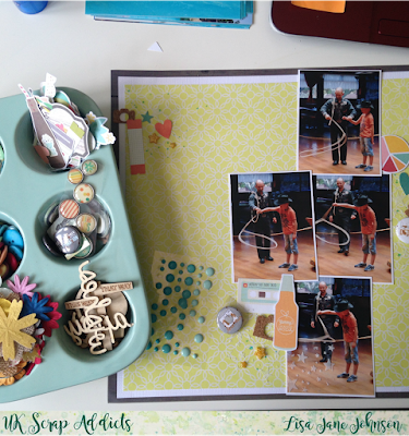
Oooh I do love a good cluster! It's Lisa-Jane from Pretty My Page here with you today with my take on how I go about creating my clusters.
I like to work in groups of three with my little collections of prettiness so once I've estimated where I think I will put my photos then I can work out where my clusters will go. For this layout I wanted to use four 3x4 photos in a rough line down the page at about a third of the way in. This meant that ideally my clusters would be spaced in a visual triangle around the line which helps to draw the eye to the main event - the photos.
Once I've chosen my 3 points I start the layering. I'm basically building a pile of bits and pieces so I need to think about using something flat and large first as a base. I recently took delivery of some mixed media stock for my new website and I couldn't wait to play with some stencils and embossing paste. I chose my yellow background paper from the Simple Stories Summer Vibes collection that I am using for this holiday album and experimented with 2 different stencils. I thought the tiny stars would be absolutely perfect for this layout of my boy learning to spin a lasso (I always thought it was lasOO!) The stencil that looks like water splashing will be great for all of the pool photos I still have to scrap...
I used the stencil on the 3 places areas and then added a little bit to a dark space in one of the photos just to see what it looked like. Then I felt like I needed a border (as I frequently do at the moment) so I trimmed an inch off one side and the bottom of the yellow sheet and layered it up on white and then a dark woodgrain. I mounted my photos on the white card that I gutted behind the yellow which helped to separate them a bit more. Then I sprinkled on some aqua coloured mist for another layer in my little gathering.
Once the main structure of the layout was stuck down I could start to embellish - my favourite part of the process! I use my Crate Paper muffin tray to hold all my embellishments for my current project so it's ideal to help me choose little bits and bobs for each of the three clusters. I always put down more than I need - this is just a first sort through to start piecing things together. I look for some flat things and some things that will add dimension and I try to use similar items and colours in each little grouping. I really wanted to use a couple of the flair badges that I've been hoarding so I chose my other embellishments to go with those. As you can see, I am one of the many who have discovered that flair badges can rust but I actually like the effect it has made and it doesn't seem to be coming through the back or through the plastic at the front.
I like to have the three groupings as 3 slightly different sizes if possible with the larger one towards the bottom as this helps to balance the layout but I don't really have any hard and fast rules about anything - I just go with the flow! As you can see I haven't stuck to my first sprinkling of embellishments - I've started with the flairs and then added in some orange to echo my son's te-shirt and then worked around those, tucking things in and around and trying not to create trapped space. Each layer gets smaller and more dimensional as I go - a bit like building a pyramid!
And here is the finished layout! Even though some of the layers are mostly hidden, I think they are still well worth including because it adds so much interest to the groupings. The stenciling and misting on the bottom creates a really subtle extra layer and you could use stamping or a bit of stitching here too. Then I've used some die cuts or stickers next, some with pop dots on to add another dimension. I've tucked in some cork cameras and added enamel dots and a couple of different sized resin stars and called it done.
Getting your clusters to look the way you want them to is a bit like a jigsaw puzzle - you start with a piece you are sure of and then try out lots of others before you are definite, even sometimes moving things that you THOUGHT you were sure of! They are well worth the effort though as they bring so much interest and dimension to your projects. You can have many little clusters all over your page and you can have them spread out rather than overlapping the layers, it's totally up to you to use the things you like in a way that pleases your own eyes.
I hope we've been inspiring you to try some clusters or to think about adding something new to your groupings, even if you are struggling to get some time to actually scrap during August (which I know can be quite a challenge for some of us!) As always, don't forget to share your projects with us either here in the comments or on our Facebook page or our Instagram and please do use #ukscrapaddicts so we can find your projects. There's a great prize up for grabs from this month's sponsor and we are always looking for amazing UK scrapbookers to feature on our pages too.
Now, go forth and make pretty pages!


No comments:
Post a Comment
Thanks for your comments...