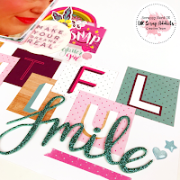
Its my turn on the blog today with my layout based on a single 4x6 photo. This seems pretty easy to work with for me and so I really concentrated on making a big bold title to fill a lot of the space on the page.
 I used the Glitter Girl collection from Shimelle for this layout as in the paper pack there was a 12x12 paper with all of the letters from the alphabet on it and I knew that I wanted to cut these apart to form the basis of my title.
 Once I had cut the paper up, I then had to decide on a title.
Now, I struggled with this as it was a photograph about myself. I decided to embrace it and call the layout Beautiful Smile.
I only added a couple of areas of embellishments which were located at the top left of my photo, the bottom right of my photo and the bottom right of the page where the title ended. I wanted to maintain a lot of white space on this layout to keep it looking clean and I was happy with the balance of embellishments v. white space on this layout.
You'll see that I tucked in a mixture of die cuts and stickers to each cluster and added a few enamel shapes to finish the page.
I hope you have enjoyed reading about my layout and be sure to head on over to our Facebook Group here to share what you have been inspired to make.
The process video for this layout is linked here for you - https://youtu.be/kpeNNlyWrX4


No comments:
Post a Comment
Thanks for your comments...