Showing posts with label wood veneer. Show all posts

Friday, 25 January 2019

Ariel ... / Jackie Ashton / No Cardstock

Hi UK scrapper, Jackie here with my layout this month using no cardstock background.


I’ve used the lovely new collection from Shimelle - Head in the Clouds and used one of my many disney photographs.

I wanted the background to be nice and bright to represent the brightness of the parade and remind me of the sunny and bright day it was, so I choose the yellow ledger as my background.

Adding a strip of patterned paper, which had mermaid on down the left hand side and add a punched border, down one edge of the strip of paper.

I added a simple layer of patterned papers behind the photograph and added some simple clusters around the page.


Don’t forget to share your layouts that you have done using this month’s prompt - no cardstock, we would love to see them over on our Facebook page.

Bye for now, happy scrapping


Thursday, 25 October 2018

Disney Selfies / Jackie Ashton / Small Photos

Hi scrappers, Jackie here, with my layout for this month theme ‘using small photographs’ - something that I love to do if I have a few of the same theme of photographs.

I decided for this months layout I would used a selection of selfies from my last visit to Disneyland Paris earlier this year.

The collection I used is Echo Park - Wish Upon a Star collection, which is a non-Disney collection  but the colours, phases, ephemera, die cuts, chipboard etc all work well with Disney photographs.


I used a patterned paper as my background and added a strip of patterned paper down the left hand side.  Added a punched border strip, and a ‘star’ border sticker down the opposite side.

I printed off a few selfies photographs, which are approximately 2.75 inch square and then decided which ones to use on my layout.  I ended up with 6 cascading down the page and added some 3D foam to a few of them to given a bit of dimension to the page.

I kept my embellishments simple and using stickers, chipboard, enamel dots from 'Wish Upon a Star' collection and a  few punched Mickey head in black cardstock, and added some  mouse wood veneer which I purchased from Pretty My Page, which are just so cute and perfect for my page.


For my title I used two different set of Thickers from my stash and added some wood veneer chevrons.


This layouts came together quickly and it is a great way to add loads of photographs to one 12x12 page.

Don’t forget to share your layouts over on our Facebook page, we would love to see them.


Till next time ....


Wednesday, 25 July 2018

Carpe Diem / Jackie Ashton / 6x6 Pads

Hi UK Scrappers,

I don’t know about you, but I love getting 6x6 pads with the collections, I tend to use them to layer behind my photographs or to die cut, but then I do end up with either bits cut out of a sheet, or an irregular piece that I don’t know what to do with it. As this months theme is to use 6x6 pads, I decided that not to do my usual thing with them, but to make a ‘messy’ jumble of papers as a background to my photograph.

Carpe Diem ...


I used the Crate Paper - Good Vibes collection, and randomly choose several sheets of patterned paper, distressed the edges and added to my cardstock - which I had previously added some distressed ink using the packaging technique to the background and stamped a few word phases over the ink.

I mounted my photograph on to some patterned paper, and placed this over the top of the messy pile of papers.


I finished the layouts with chipboard pieces, stickers and die-cuts from the collection.   As the photographs was taken in Disney I punched some ‘mickey heads’ in patterned paper, and added three clusters to my page.  


I also added some cute ‘mickey head’ wood veneer.

For the title I used two perspextives from Bramble Fox.


How do you use your 6x6 pads? please share with us what you do, we would love to see them on our Facebook group.

Till next time ...


Monday, 25 June 2018

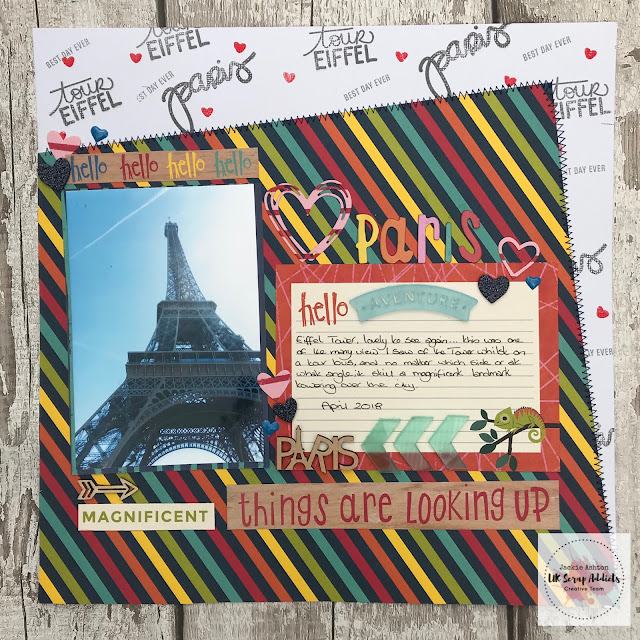
Things are Looking Up / Jackie Ashton / 4x6 photograph

Hi UK Scrappers, Jackie here with my take on the this months challenge, use a 6x4 photograph on your layout.  When I first started to scrapbook, all my photographs where standard 6x4 but over the years I have used various sized photographs on my pages and hardly use standard 6x4 anymore, so this theme was a welcome change from the sizes I normally use, and one I will remember to do more of in the future.

Paris - Things are Looking Up


I kept my layout minimalistic as I wanted the main focus to be my photograph, and having the colourfulness of the patterned paper I didn't  think the page needed too many embellishments.

I used the lovely colourful collection from Shimelle - Box of Crayons and stamped some words on the white cardstock.


These acyclic I got whilst in Paris and work perfectly with  this layout, as well as the wood veneer.


The title strips come from the cut-a-part sheet from the same collection.


If you don’t scrap with 6x4 photographs, why not give it a go, we would love to see what you create in our Facebook group.

Till next time ...


Sunday, 13 May 2018

Right Now | Elaine King | Monochrome

Good morning Everyone

Thanks for joining me on my first blog post since becoming a member of the UKScrap Addicts Creative Team.

Today I am bringing you a layout using a monochrome colours. There was some discussion in the team as to how we would define Monochrome, but essentially we all agreed that using just one colour, regardless of how many tones there were, and, if you would like to, adding in a tiny amount of black in amongst the colour was the definition. I hope that helps?

So, here is my layout.


For this I decided to use one of my all time favourite collections from Kaisercraft that I originally sourced from Merly Impressions, one of the leading Kaisercraft suppliers in the UK. This collection is called  Indigo Skies and, of course, is predominantly blue! Lol

To start my layout, I used a starry stencil using texture paste that I had added a little denim coloured distress ink too. 


I then used a 3" piece of the collection paper to pace at the left hand side where I then added two further strips of paper too. I then set about fussy cutting several flowers from the patterned papers and created a cluster at the bottom left of the photo and added a tag and some strips of paper on the right.


I added several enamel dots and a twirl of blue and white bakers twine in amongst the cluster and added a couple of wood veneers that I had coloured with distress ink too. 

One of my favourite 'techniques' and one that gets overlooked a lot, is to literally take a few 'chomps' of punched edge from the sides too. Once I had done this I trimmed the paper down to 11" x 11" and backed it onto a piece of blue cardstock too. 
I do hope you will join in our challenge this month..especially as we are in the month of National Scrapbooking Day too! Go on! Have some fun and do let us know what you've been up to. 


Wednesday, 25 April 2018

Explore | Tags | Jackie Ashton

Hi scrappers, Jackie here with my take on this months theme ‘tags’.

This is my layout ...


 and as you can see I went for the 'more is best approach' and die cut various sizes of tags from patterned papers and used them as a base for my photographs.

I used Crate Paper - Here and There collection, which I purchased from Hey Little Magpie.

I mainly used the 6x6 pad, and a few scraps that was left over from a previous layout, as well as added with printed vellum from the same collection to give my page some added texture and detail.


Before laying the tags across the page, I added some ink to the background using Tim Holtz - Distress Inks and the packaging technique, then added white thread to each of the tags.

I also added some hidden journalling behind the photographs, tag was cut from white cardstock and I added a piece of patterned paper on the front, with the journalling on the back.


I added my photographs to my layouts mounted then onto some 6x6 pattered paper.

I then finished my layout with some chipboard and puffy word stickers from the collection and some wood veneer from my stash.


We would love to see how you use tags on your layouts, please share with us on our Facebook page we would all love to see them.


Sunday, 25 February 2018

Shoot for the Stars / Jackie Ashton / Choose a Shape

Hi Jackie here, this months challenge is  ‘choose a shape’, my current favourite shape are stars, who doesn’t like a stars or two added to their layouts, I know I do.  


The collection I’ve used for this layouts is Crate Paper - Good Vibes.   I started by die cutting several different sizes of stars, including a few vellum ones, to use a base for my photographs.  


I also added a few open die cut star borders, which I cut in half and added around the page.


For the title I used a prespextive from Bramble Fox which was just perfect for my layout, as well as scattering some prespextive stars and wood veneer stars around the layout.


I added some stamped words and phases to be background paper,  using the stamp set that came with the Crate Paper - Good Vibes collection.

The layout came together really quickly and I love the end result, this is a great way of using up your scraps or 6x6 paper pads that have bold prints, die cutting them you can add to your layout and still get the effect you want.


Sunday, 4 February 2018

Squad Goals | Terri Morris | Star Shape

Here on the UK Scrap Addicts blog this month we have  been challenged to pick a specific shape and use that as a focus for our layout. Whether it be a main element or more subtle with the embellishments as I have done here.


I chose the star shape as my main focus and used lots of different types of stars to add my embellishment to the page. I have puffy sticker, paper topped with vellum, wood veneer and cork stars dotted across the page.


This is one of my go to layout designs if my mojo is on the blink and I always love how different it looks as its heavily dependent on the patterned paper and embellishments used.


I used the large puffy sticker style words to create my title and then finished it off by adding and embellishment cluster to the bottom of it. I'm loving the colour scheme of the Crate Paper Good Vibes collection it seems to fit so many of the photos I have taken recently.


Thanks for looking. We would love to see any creations you make this month so be sure to tag us on Instagram.

Happy Crafting!


Wednesday, 27 September 2017

Epic Fail | Lisa-Jane Johnson | Journalling

It's Lisa-Jane from Pretty My Page here today with my take on getting some journalling onto our layouts.  I'm the first to admit that although I believe scrapbooking should be about the story as much as anything else, sometimes there just isn't a story to tell, and that's fine.  Other times there is a story and we plan to come back to it and add it, but we don't, and that's fine too (there are no scrapbooking police thank goodness!) I am definitely guilty of this!  So for this challenge I chose a photo that had a definite story attached and I made sure I got it down on the page!


I didn't actually have a plan in mind when I was pulling out some papers to go with the photo.  Then I came across this Pink Paislee paper with the diagonal hand writing on and I was inspired to create something similar with my journalling.  I didn't intend to use the actual paper as it was the wrong sort of grey but I'm glad I happened across it.


I wanted to create the journalling on a slight diagonal like the paper but of course you can't do that with a 12x12 piece as you need a bit of extra real estate to allow for the slant.  Luckily the pattern in the paper worked in any direction so I was able to rotate it slightly to give me enough to cover right across.  I trimmed off the corners and then matched up the top and bottom, and voila - I have a diagonal piece that stretches right the way across.  


I wanted to add a contrasting strip in above and below the main piece but it obviously meant I would have the same problem with it not reaching.  The pattern on this piece couldn't be cut on an angle so I broke the strips and stuck the ends down first which left me with a little strategically placed gap to cover up.  I also added some stencilling to add another subtle layer.  I used the Ranger blending tool and the Grunge stencil from the Pretty My Page shop with some Tim Holtz Pumice Stone Distress Ink because the story was partly about the mess in the house during our first lot of renovations.


Before I set to work on the journalling, I wanted to add in any base layers for the clusters so that I knew how much room I had to work with.  I didn't add the rest of the embellishments until afterwards so I could write without being impeded or getting enamel dots stuck to my elbow...  The dots and hearts are from the Pretty My Page shop and the stick pins and metal studs are very old bits from my stash which always makes me feel good :-)


Typically on the day I did the journalling, my arthritis was quite bad in my hands and they did not want to be flexible and allow me to write neatly at all!  I didn't keep to the right slant on the stop half either and I considered redoing the background but, you know, life's too short!  And anyway, the whole story was to do with mess and chaos things being out of place so it's quite fitting really!  In the picture I was taking a moment to try and focus on the positives of the renovations which hadn't gone very well.  We were almost at the point of getting the bath in so I posted this picture on Facebook to say "yay, we are getting somewhere, it's not so bad, etc".


Then 5 minutes later the children were charging around and not heeding my warnings and consequently tipped over the bath bashing them both on the head and trapping them underneath! My son ended up with a huge egg on his head and my daughter was fine until she realised her big brother was getting all the attention and she started howling too!  I do think it is important to journal the not so good things about life too, don't you?!  The journalling here blends with the design because it was intentional in it's placement and the grey background means that the writing doesn't stick out.  I wish my writing was neater but here it becomes part of the design and I'm happy with that.  

Don't forget to enter the journalling challenge on our Facebook page to be in with a chance of winning the prize draw for vouchers for the Pretty My Page shop and as always, we'd love to see what you create so don't forget to hash tag us!

 Now go forth and make pretty pages!